The trouble with breaching the threshold lies in a need to understand the “fixedness” of a term. This is further complicated by the necessity to understand multiple terms which lie within that primary term and, consequently, their fixedness as well, so as to unearth a “flexibility.”
Terms have been established to point us to some sort of (maybe) universally understood “meaning,” or a mutually agreed upon set of qualities that compose the term’s use in an effort to better communicate a set of ideas, etc. based on a shared knowledge of what those terms mean [1]. From this fixed point, or specificity, comes the potential for flexibility and more so, interpretive flexibility. Interpretive flexibility allows us, in either art or theoretical discourse, to stretch and flex certain qualities into a nuanced and multi-faceted space of inquiry. Interpretive flexibility, therefore, is born out of (usually) a practical understanding of the classificatory implications embedded in the language utilized to frame them.
“Publication” is just one term which points to many terms representing a diverse range of objects [2] and activities [3]. All of which we may have yet to grasp with a totality or thoroughness to match our understanding of the holy trinity that has been the descriptive foundation of Book Arts: book, paper, and print. An example that might help clarify this proposition within one branch of Book Arts practicum is letterpress printing.
Within a studio course for letterpress we emphasize using specified terminology when identifying parts of the press, the tools used for the process of printing, type, the layout of a job case, etc. In the process of printing, it is stressed (here: in traditional practice) that one must “master the process of printing” before making such “experimental” leaps that often lead (or have lead to) “products” or “finished works” heralded for their affective qualities, or “artistic expression.” An intimate and shared understanding of the materially, socially, and culturally complex (yet practical) foundation that defines “letterpress” [4] aids our ability to interpret nuances of “expression” (possible intent), leading to possible interpretations (or constructs) of “meaning” unique to theorists or critics in different fields of specialization. This further demonstrates the potential of specificity internally (within one field for “artistic expression”) to externally (in other fields that take interest in one or many of the original term’s functions, or course of operation). Thinking of primary, secondary, and tertiary fixedness in totality is better framed now as a fixed assemblage [5].
A field’s ability to render their evaluations relevant remains tied to the fixed assemblage of meaning embedded in the object of interest, which includes but is not limited to such complex qualities as: materiality, methods of production, final form(at) or type, and its pattern of movement (circulation or distribution). The latter of which is both effected and affected by its initial overall assemblage (the shape or format wherein its meaning is not necessarily contained, but held in some capacity).
It is only when the term, as fixed assemblage, is thoroughly understood that we can exercise interpretive flexibility.
My concern with the present patterns of integrating both new media form(at)s and alternative (or digital) production methods into Book Arts curriculum lies in a negligence in tending to the foundation of these new forms and their place in the larger schema of the fixed assemblage of “publication.” E.g. when considering online publication, we rarely (in curriculum) acknowledge it as a surveilled and privileged space of access that is perhaps no more (if not less) environmentally friendly than a sewn paper pamphlet.
Integration seems to only consider similarities rather than differences. This points to a pattern of isolation, inclination towards homogeneity, and a non-reciprocating relationship to the broader fields of fine arts practicum and liberal arts scholarship. These form(at)s can be located here but must be seen as also distinctively not here.
The materiality of publications vary wildly despite the fact that a .PDF or website or online journal are part of the same technological and communicative lineage as the book. The electronic format remains qualitatively and quantitatively distinct. The materiality embedded in these various published formats is awash with different social, cultural, political, and theoretical concerns and contexts. This begins with the nuances implicit in their fixedness which extends to varying levels or manifestations of flexibility only afforded by the fixed assemblage.
Without saying much more, I would like to narrow this to published documents (where the future of my investigation lies), and make the following statements:
● A book is a document and can be published, thereby a type of publication.
● A document need not be a book to be published, but “document” accounts for multiple types of publication.
● Various types of published documents are produced in unique ways, utilizing different materials and processes, thereby moving, or circulating, by different means, making both their physical manifestation and distribution patterns differ wildly.
● As aesthetic forms, they further complicate these patterns which also impact their overall affective capacity.
● No(thing) is the same.
[It should be noted that I support interpretive flexibility; the merits of poetics to shed light on otherwise darkened spaces of a wor(l)d [6] accounts for some of the most significant theoretical and critical arguments I’ve seen (whether or not we read them that way is dependent on who you talk to). However, the terms utilized ultimately provide clarity and commonality that must go both ways.]
A case for the fixed assemblage, (or specificity?) may seem an isolating phenomenon, a sort of “caging in” that goes against an aesthetic, and thereby artistic, line of critical inquiry. But, it is in fact, a rich place to explore. Why do we resist what is in many ways a democratic modality?
Please consider the following visual exercise:
Example 1: Document in “Common Culture” - Academic Paper
.jpg)
Fig. 1. DOI = Digital Object Identifier; document accessed via library search database. Blanchette, J.-F. (2011). A material history of bits. J. Am. Soc. Inf. Sci., 62(6), 1042–1057. https://doi.org/10.1002/asi.21542
Fig. 2. (digital document) PDF = Portable Document Format; downloaded from online journal and opened on desktop.
Fig. 3. (paper document) printed PDF
Fig. 4. (PDF as paper document) converting PDF as paper document back to PDF as digital document using Scanner Pro.
Fig. 5. (PDF_02; digital document)
Example 2: Document in “Artistic Culture” – Artist Publication
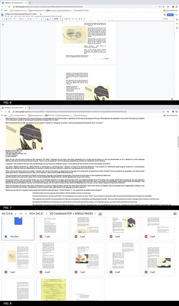
Fig. 6. (web-based digital document) Located in Google Drive as Google Document
Fig. 7. (web-based digital publication) published Google document. H.R. Buechler and Vida Sačić, notes for a conversation on: “Like Some Female Hamlet” (New York: Oxblood Publishing, 2017) https://tinyurl.com/td5h8cq
Fig. 8. (conversion of web-based digital document to PDF-for-print)

Fig. 9. (digital document, PDF-for-print)
Fig. 10. (publication as paper document) H.R. Buechler and Vida Sačić, notes for a conversation on: “Like Some Female Hamlet” (New York: Oxblood Publishing, 2018)
Fig. 11. (publication as paper document) Buechler and Sačić, notes for a conversation (2018)
---
[1] This is akin to the idea of “concreteness,” “structural integrity,” or “specificity” – as discussed in Part 1 and 2, and which exist within particular frames and establish their framework.
[2] noun., formats
[3] verb., function of n. and the cultural and social implications of n. as v.
[4] This aligns with one aspect of documents in Michael Buckland’s Document Theory: An Introduction (Zadar, 2013). Following the phenomenological aspect, is cultural codes. Cultural codes state, “All forms of communicative expression depend on some shared understandings, which can be thought of as language in a broad sense.” At this point, I have not mentioned the document as an object of interest. However, that is ultimately what I am concerned with.
[5] Of course, Delueze and Guattari’s theory of assemblage notably argues against fixedness or stability, and therefore seems in direct opposition to the term with which it is partnered here. Yet, it is in fact, apt. When dissected, we would find the fixed assemblage is not definitively fixed at all, but an oscillating entity. See: Gilles Deleuze and Félix Guattari, A Thousand Plateaus, trans. Brian Massumi (Minneapolis: University of Minnesota Press, 1987)
[6] Credit for this poetic adaptation of the word for emphasizing two readings should be given to Johanna Drucker, History of the/my Wor(l)d (1995)
H.R. Buechler is an interdisciplinary artist, researcher, and founder of OXBLOOD publishing. Her work is broadly concerned with historic and contemporary communication technology, classification, and the valorization of aesthetic objects.