

|
|
Are you a CBAA member and interested in being considered for our featured artist section? Email a link to your website or 3 images of your work to artistofthemonth@collegebookart.org. We will contact you with more information.
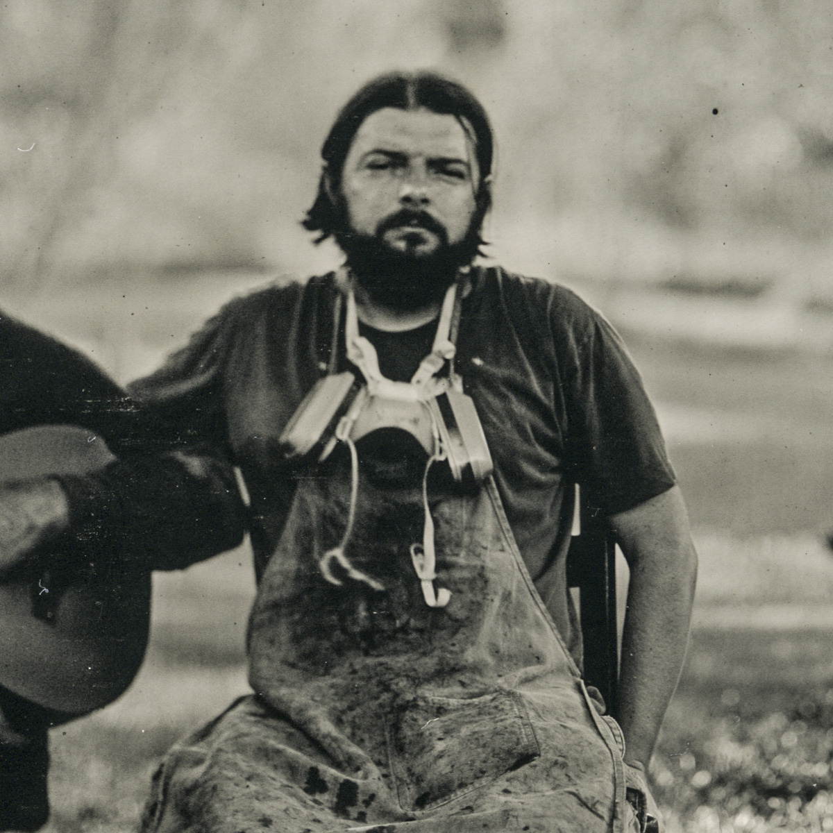
Frank Hamrick
Ruston, Louisiana
www.frankhamrick.com
Instagram @frankhamrickart
BIOGRAPHY
 Oxford American Magazine and NPR have written about Frank Hamrick’s art. His work is collected by the Amon Carter Museum of American Art, The Art Institute of Chicago and The Ogden Museum of Southern Art. Frank is theMFA graduate program coordinator and Professor at Louisiana Tech University’s School of Design in Ruston.
Born in Georgia, Frank grew up surrounded by the writing of Flannery O’Conner and Alice Walker, as well as the music of Little Richard, Otis Redding and The Allman Brothers Band. Frank’s handmade books combine photography and storytelling with papermaking and letterpress printing to address time, relationships and home. Frank’s limited edition artist’s book of tintype images Harder than writing a good haiku earned the 2017 Houston Center for Photography Fellowship and was awarded first place in the 2017 The Los Angeles Festival of Photography’s Photobook Competition. His most recent book is It was there all along.
IT WAS THERE ALL ALONG – STATEMENT
Water is universal, connecting people to one another and to nature. As the grandson of a well driller, I learned at an early age that water does not originate from a faucet, nor simply disappear after going down the drain. It was there all along is a limited edition artists’ book of wet plate collodion tintype photographs responding to water related issues, ranging from recreation, farming, transportation, flooding, to coastal erosion.
If a photograph is considered in the same manner as a single song, then an artists’ book is similar to an entire album of music complete with cover art and liner notes. Artists’ books allow for the combination of images with text and the incorporation of materials, like handmade paper, and processes, such as letterpress, staining, and layering various colors of paper to create limited edition works of art that can convey a more complete, realized idea than a single image is capable of doing.
The pieces I make have particular meaning to me, but I understand other people will see them in their own way. My artwork is not necessarily created to illustrate or provide answers. If anything, I would like for my art to generate more questions. I do not see them as endpoints, but rather starting places where I give the viewer ideas to ponder and allow room for their imagination to create the rest of the story.
ARTIST'S WQRK
Project Descriptions
PENLAND SCHOOL OF CRAFT
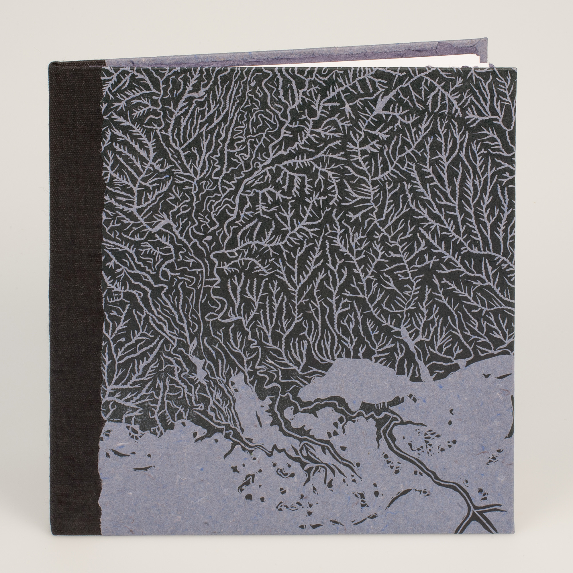
It was There All Along
Handmade Artist’s Book
8.875 x 9 x .375”
2019
First hardcover edition of 55 copies
Cover art relief printed onto handmade cotton rag paper. Edition number of each book letterpressed on the back end sheet. Textblock contains 22 inkjet reproductions of tintype photographs printed on double-sided matte Red River Paper. Canapetta backcloth used for the quarter cloth binding.
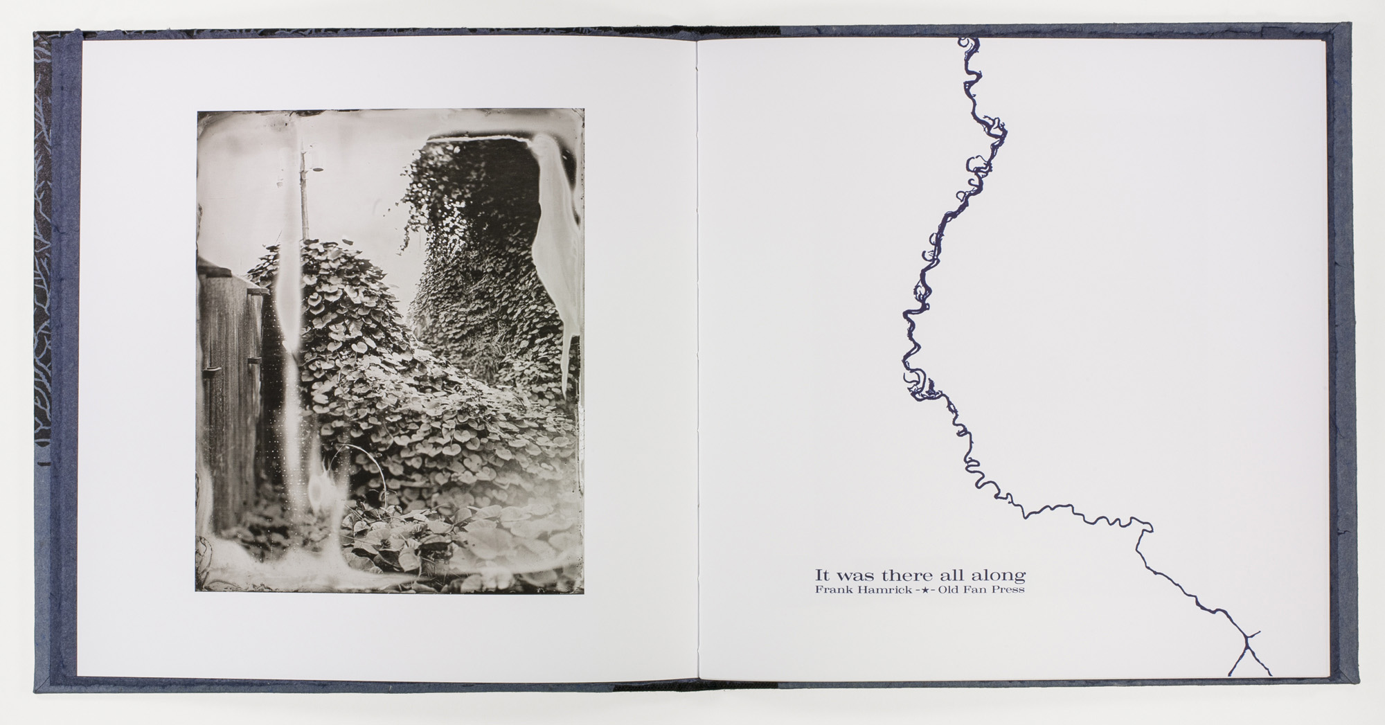
It was There All Along
Images: Flood Wall / Kudzu
Title Page with Mississippi River illustration
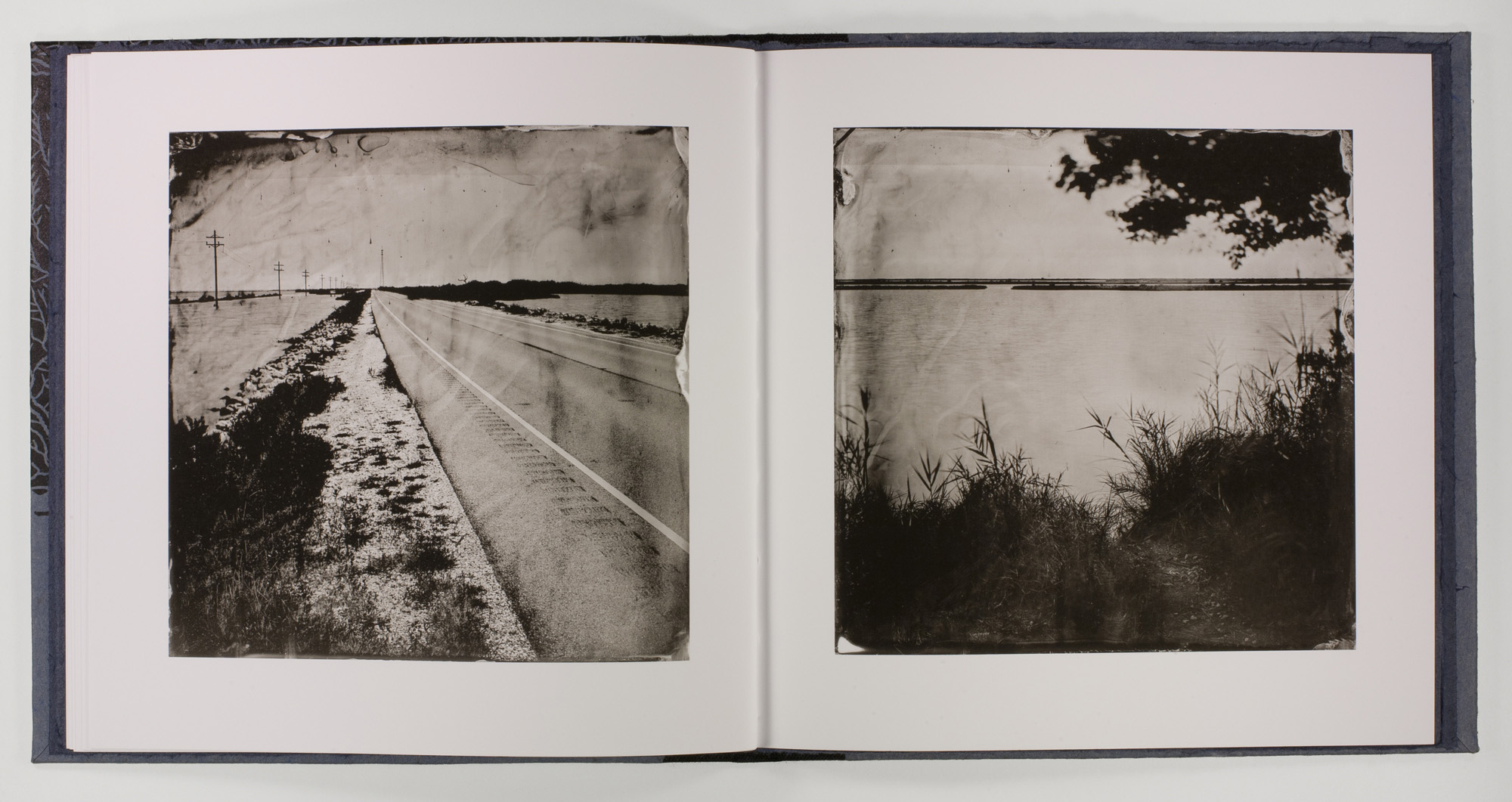
It was There All Along
Images: Highway 1, Grand Isle, Louisiana Broken Coastline, Grande Isle, Louisiana
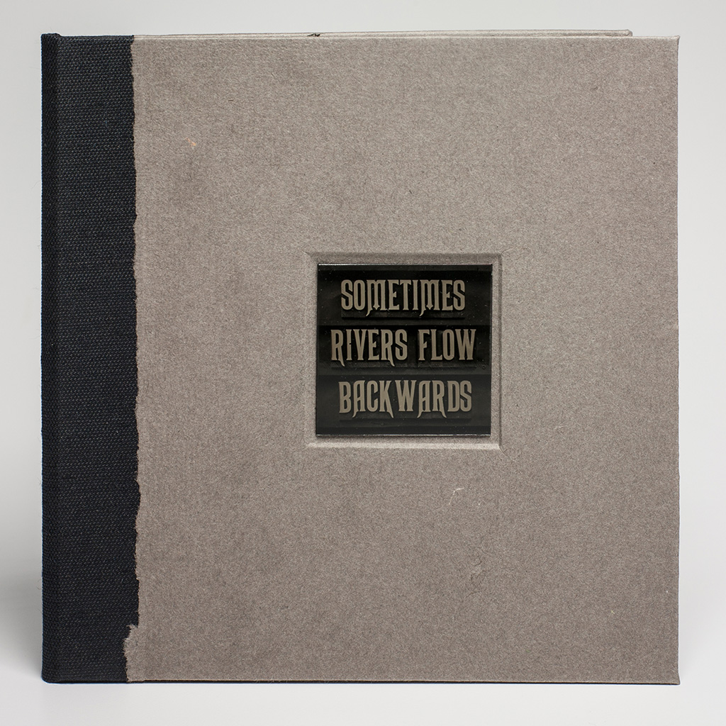
Sometimes Rivers Flow Backwards
Handmade Artist's Book
7.375 x 7.5 x .375”
2014
Standard edition of 25 copies
Gatefold edition of 25 copies
Handmade cotton rag paper covers and end sheets. Actual tintype of wooden letterpress type inset into gatefold edition. Text block inkjet reproductions of 12 tintype images on double-sided matte Red River Paper. Canapetta bookcloth for the quarter cover.
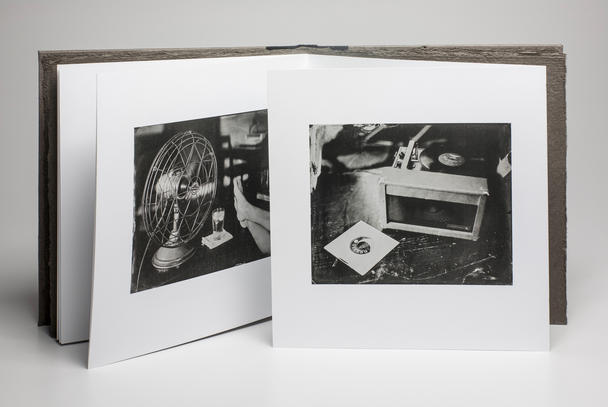
Sometimes Rivers Flow Backwards
Tintype Images: Fan, Water, Feet Record Player
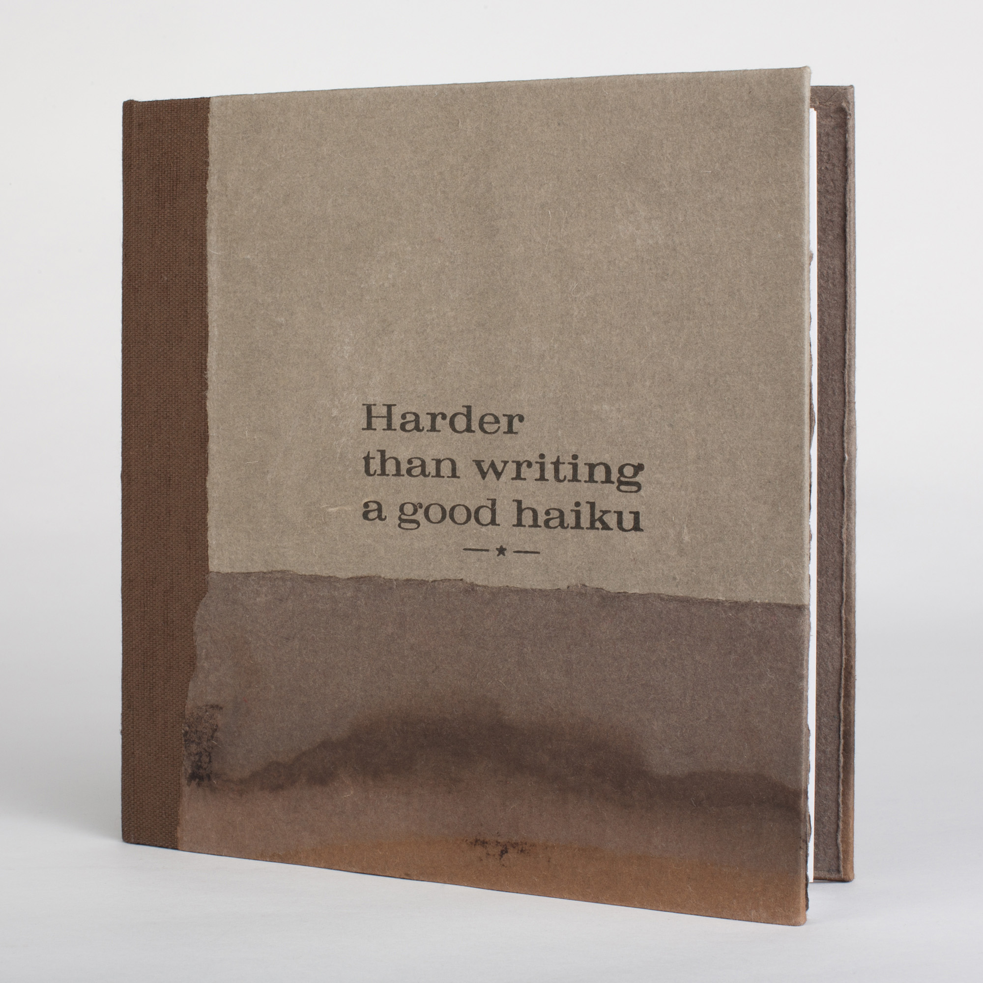
Harder than writing a good haiku
Handmade Artist’s Book
7.375 x 7.5 x .375”
2016
Softcover edition of ten copies
Two softcover A/P copies
Hardcover edition of 35 copies
Title letterpressed onto handmade cotton rag paper tea stained covers and end sheets. Edition number letterpressed into back end sheet. Text block inkjet reproductions of 17 tintype images on double-sided matte Red River Paper. Canapetta bookcloth for the quarter cover.
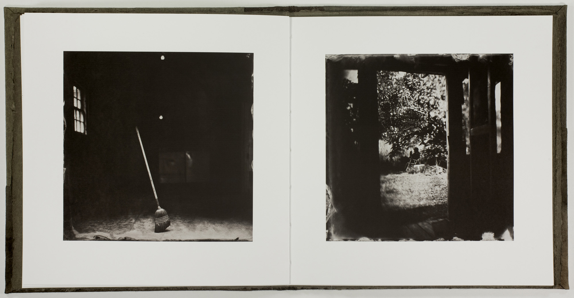
Harder than writing a good haiku
Tintype images: Standing Broom David in Sowsopia
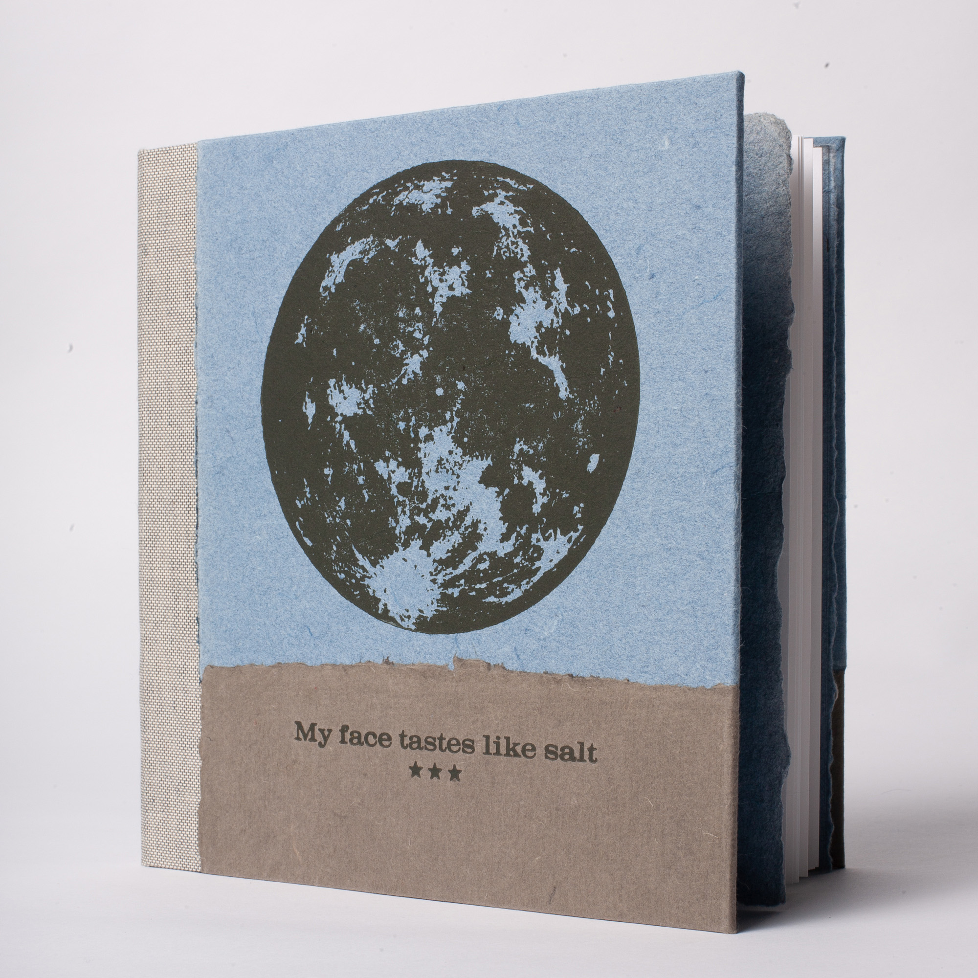
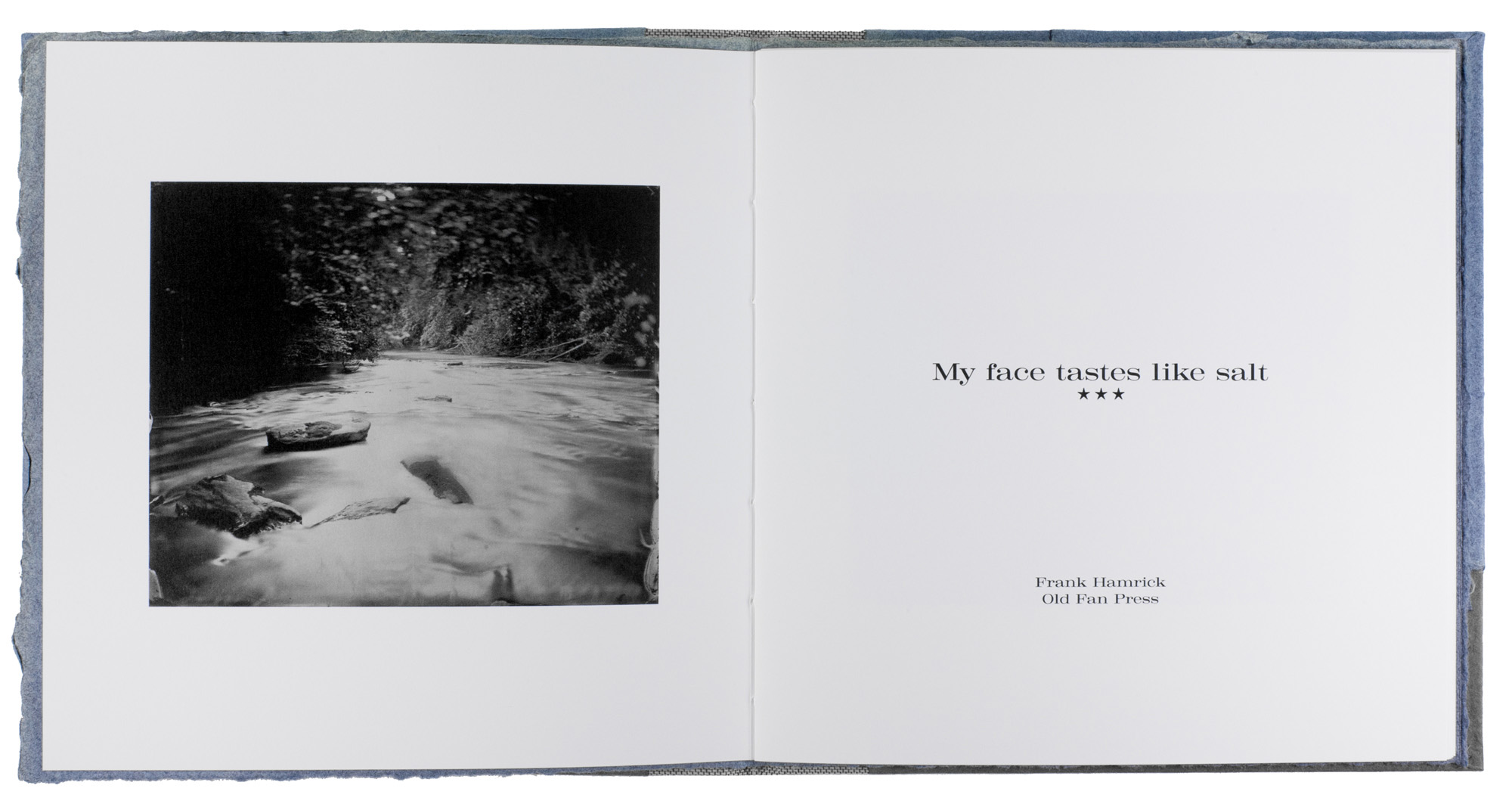
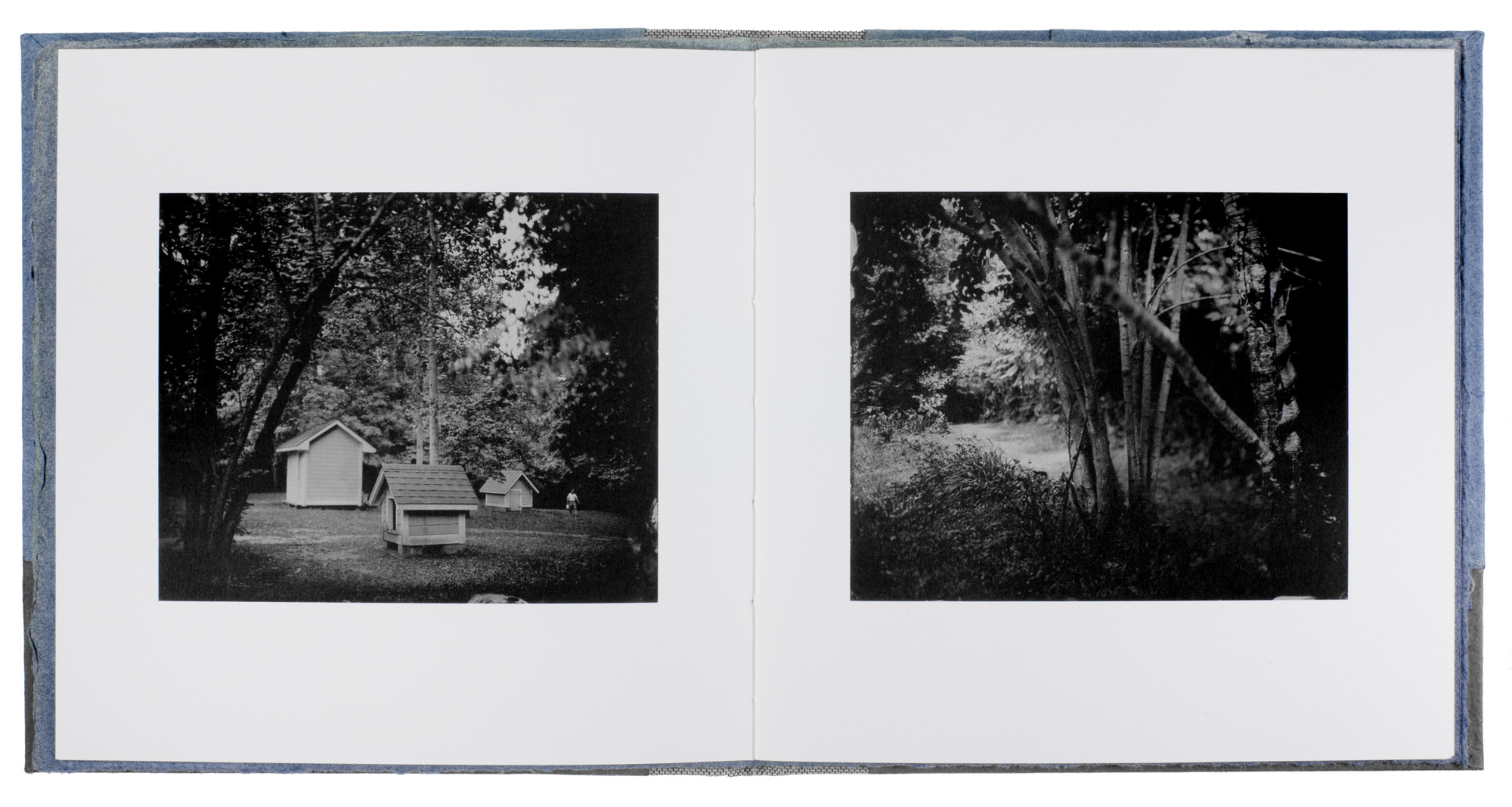
My face tastes like salt
Handmade Artist’s Book
7.375 x 7.5 x .375”
2017
Hardcover edition of 41 copies
Six S/P copies
Title and cover art relief printed onto handmade cotton rag paper. Edition number letterpressed onto the back end sheet of each book. 18 tintype photographs reproduced in the text block via Indigo digital printing.
My face tastes like salt
Tintype image: Tesnatee Creek Title Page
My face tastes like salt
Tintype images: Shovel Corkscrew Tree
|


