I sat down recently with Christopher Michlig, a colleague at the University of Oregon who serves as Graduate Director and Core faculty. Christopher’s artwork spans media, but he has a special interest in outmoded print technologies such as letterpress and Risograph. He co-edited In the Good Name of the Company, a book about Colby Poster Printing Company in LA. We talked about a large-scale poster project he has underway.
Chistopher Michlig
RC: Can you describe the project?
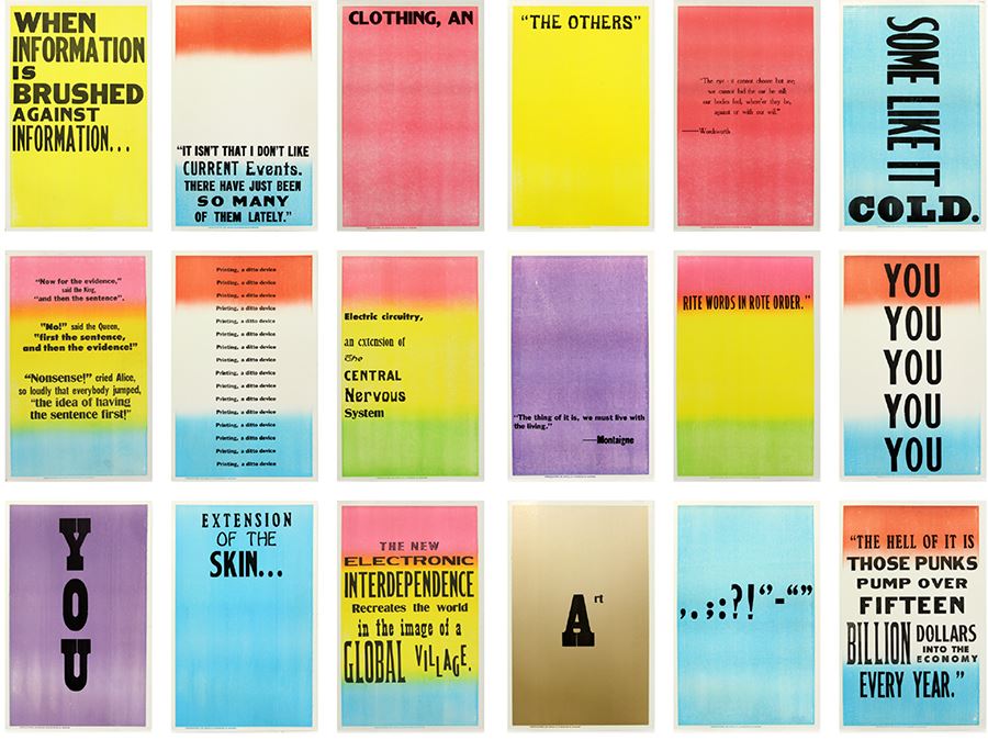
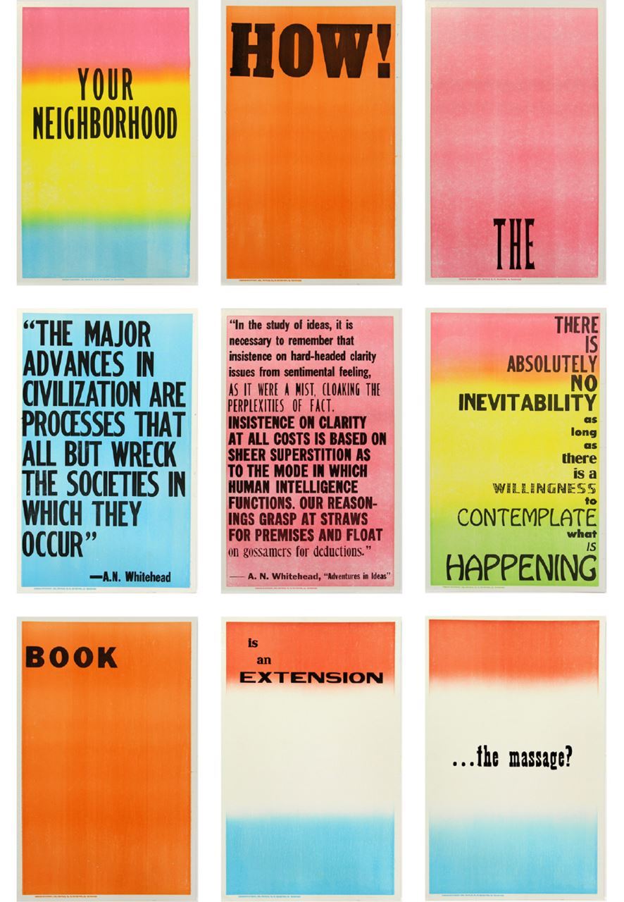
CM: I’m interested in interpreting one medium through another, in this case, a re-presentation of The Medium Is the Message as a series of 64 posters in wood type. The long essays aren’t included, just moments made typographically noticeable by Quentin Fiori’s design. I like re-presenting McLuhan’s ideas in a format that preceded his criticism. There’s a kind of time travel.
RC: What happens in that disjunction?
CM: When a page becomes a broadside, the anecdotal phrase takes on an event quality. It announces itself singularly, without context. As for the time travel, I like how it acknowledges the trajectory of printed media. The press that printed the posters, Tribune Showprint in Indiana, is the oldest operating letterpress company in the US.
RC: What was it like working with them?
CM: They refused to work with me for about three months. They thought the project was too big. I said it was fine if it took 6 or 7 months, which it did. The only thing I asked was that one person work on it so I’d have a contact. I had approached them previously about doing a type specimen book, but they absolutely couldn’t. Everything had been moved around; typefaces weren’t complete or identifiable. I used their interest in a specimen book as a hook. From one poster to the next we cycled through as much type as possible. Eventually the printer was working with typefaces she hadn’t used for as long as she’d worked there.
RC: How much direction did you give?
CM: I laid out basic formatting, but I wanted the printer to use her own methods and have creative latitude. Some posters were too long to set in one typeface, so she came up with exciting mixtures. I wasn’t there in person. We were playing telephone or she was texting me photographs of proofs. We fixed typos by text or email.
RC: Why was it important to forfeit control?
CM: To allow efficiencies and expertise to happen. That’s the magic of letterpress job printers. Setting type across a page, it makes sense to use a condensed or expanded letter in the same size to avoid wasting time with furniture. That economy results in a specific visual language I like. I wanted to open up opportunities for miscommunication to happen. That’s very much in the spirit of The Medium is the Message, how communication mutates or warps from one medium to the next.
RC: So having someone set the type also introduced space for communication.
CM: Tribune works this way for one-off posters, but a longer project revealed the potentials of the interaction. I like printing—the paper, ink, and experience—but the back and forth was essential. Tribune had no interest in the project’s artistic merit or in authorship. Their name is on every broadside so they acknowledge their creative labor within an economic structure. But for them it’s not a matter of whether they want to do a project, but if it’s possible. In this case, yes, the book can be re-typeset.
RC: What was their reaction to the posters?
CM: Matter of fact. They wrapped them as though they were circus posters and sent them to me. I wanted an interaction like that.
RC: They focused on the medium, not the message. In this case, maybe the medium is the medium.
CM: The medium conveys how they’re thinking. When a poster came back with five typefaces, then that told me something about how they’d responded. It said it was read; there was a tuning to the voice of the text.
Chistopher Michlig