Recent Blog Posts


Book Art Theory

Capitalizing on the interdisciplinary nature of the field, this blog calls attention to criticism and theory about the book as a medium and/or subject in works of art and, more generally, about book art. It seeks to encourage dialogue, solicit comments, and create a generative space for new ideas from critics and theorists of various fields regarding the aesthetic, semiotic, haptic, cognitive, historical, and other features that distinguish these works and their function in ethical, political, and social matters.

To contribute to the list of underrepresented voices in the book arts, see CBAA Book Art + Social Justice Resource List.

  • 15 May 2021 12:00 AM | Susan Viguers (Administrator)

    Most of our collective lives for the past year and a half have been filtered through pixels, but even before the major cultural pivot toward digital spaces that was made necessary by the pandemic, the digital age has been in full swing for a while now and artists have been finding it more important to consider the ways our tactile, dimensional, and time-based artist books are experienced virtually.

    Artist books often require the maker to plan the entire project before even purchasing materials to begin making. If I haven’t decided on the binding or printing processes, I won’t know how much paper I need, what size sheets to purchase, etc. So, in that initial planning stage, is it also necessary to take into consideration the way the book will be virtually experienced and allow those considerations to change our projects?

    It’s easy to see how websites and a social media presence are beneficial for artists, but an inevitable product is how the digital space can affect the art that is created. If algorithms boost bold, edgy, graphic images and your subtle, gentle, hard-to-photograph artist book doesn’t get high engagement, it may feel like a less successful project. Consciously or unconsciously, the artistic trends of today are coded by social media. Making an effort to embrace or ignore that influence is worth thinking about.


    Image courtesy of Beth Sheehan and Small Editions

    I believe that the idea or concept behind the artist book should dictate the materials, processes, and viewer’s experience of the book and in the same way, I think the intended experience should dictate the digital translation the project receives. If every artist book is documented as if it were a codex, the viewer is robbed and if every artist book is made so that it is easy to document, the viewer is robbed. Finding a balance that works for your art practice is important.

    Even if you have not considered the way your artist book will be experienced virtually at the start of your project, documenting the finished book to accurately reflect the work is incredibly important given how much of the global audience will not see the work in person. Artist books are usually 3-dimensional, intimate, and time-based but standard photographing can flatten the work. Along with the usual considerations such as proper lighting, a quality background, image size and quality, color correction, and documenting multiple angles, you may also want to consider the following. Taking photographs of the book being handled gives the viewer an idea of scale as well as demonstrating the way the viewer should interact with the book. Photographing each page from the same angle to create a gif or slideshow can be helpful for instances where videos are not possible. You may also want to consider creating multiple short video clips that serve various purposes such as an instructional video about displaying the book, a “product” video that showcases the features, a behind-the-scenes process video, and an experience video that acts as the viewer handling the book themselves.


    Image courtesy of the Quarantine Public Library

    Additionally, there is a lot to be said for creating artist books that will live exclusively in a digital space and quite a lot of artists are producing projects that fully consider their virtual existence. Not only does a digital experience of an artist book make it more accessible but considering the benefits of digital media can push the world of artist books so much further. The Quarantine Public Library has made it a priority to provide access to artist books, as well as providing an avenue to begin or build your art collection. They are a virtual library containing one-page artist books for patrons to print, fold, and read at home for free. Bringing artist books to those that may not get the chance to see them otherwise spreads creativity and boosts the book arts community.


    Image courtesy of the New Jersey Book Arts Symposium

    The digital era has changed book arts in more direct ways as well. Book artists have been integrating digital elements into physical artworks, creating virtual exhibitions such as the exhibition titled Tumultuous Absence (pictured above) during the NJ Book Arts Symposium and pushing the definition of “artist books” through digital technologies. The worlds of virtual reality and augmented reality are spreading through the art world as well. One of the most exciting examples is an app called Tropi created by the non-profit Interactive Initiative. The app uses augmented reality to bring South Florida artists’ works to life, allowing viewers to physically walk up to and around the artworks that they are seeing through their phone. Imagine walking through one of your artist books!


    Image courtesy of Interactive Initiative


    Beth Sheehan is an artist currently living in Tuscaloosa, AL. She teaches paper, print, and book workshops around the US and virtually. She co-authored the book Bookforms. Sheehan has also worked as a professional printer at Durham Press and Harlan and Weaver and was the Bindery Manager at Small Editions.  


  • 27 Apr 2021 12:00 AM | Susan Viguers (Administrator)


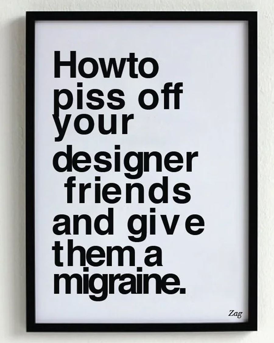
          Intentionally bad typography: this meme has been circulating for at least six years.

    "Authenticity" is one of the topics in my Critique Workshop. We see many works of book art that are made by people with a lack of training or experience, but with a lot to say. As educators we see lots of that. Some of the most powerful work I've seen was made by inner city teens in a series of Center for Book Arts (CBA) summer workshops titled Cultural Autobiography, conducted by Cheryl Shackleton Hawkins 1993-2000. 


    Work by Antonia Pocock for the exhibition Student Work and Cultural AutobiographyCenter for Book Arts, Sept. 1 to Oct. 31, 2000.

    Sometimes we see works that are done by highly skilled practitioners in a style that appears to be untrained. Is it simply fake outsider art, or does the intent of the creator play an important role in critical evaluation? Is it important that the viewer knows what the creator was trying to achieve? Does the medium in which it appears make a difference? Does it matter if the target audience is Artworld insiders or the general public? 

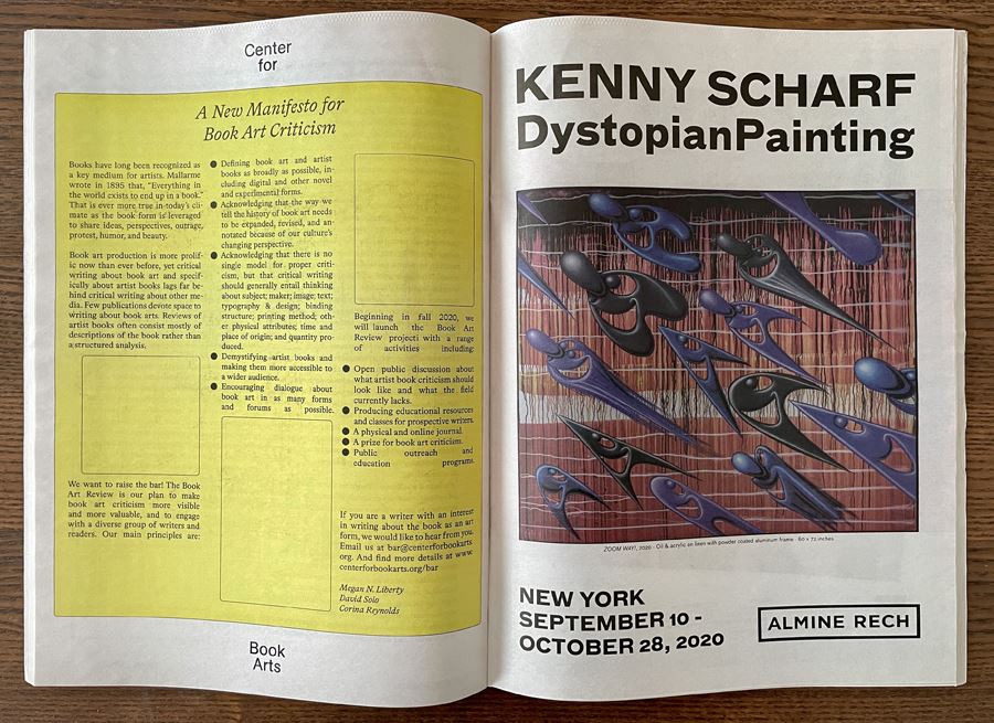
    This issue arose close to home last September, when CBA published "A New Manifesto for Book Art Criticism" as a full page ad in The Brooklyn Rail, as a web page, and as a PDF


    When I first saw it I sent an email to CBA asking if was done by a volunteer or a student, noting the inconsistent line spacing, justification, and other typographic issues. A reply came quickly: 

                "This design was created by knowledgeable, professional designers who are highly regarded in their field. And from a contemporary design perspective it is right on point. The word spacing, hyphenation, and box outlines are all conceptually related to the content of the manifesto and the history of artist’s book criticism."

    I was confused and mystified. What is the conceptual relationship of ugly typography that is hard to read to a manifesto advocating criticism of typography and design?  Was that the point? Was this meant to be criticized? Or to be seen by a specific audience? Was it a joke? I've read some artist book criticism, and written some, as well as conducting Critique Workshops for four decades. I needed to ask for advice from those who know more about typography, so I wrote to a few typographers, including the designers of the manifesto. Robert Bringhurst, author of The Elements of Typographic Style, was the first to respond:

                "Professionalism has its pitfalls as well as its benefits. You of all people will recall the distinguished economist Arthur Okun’s observation that 'anyone except an economist knows without asking why money shouldn’t buy some things.' I fear it’s also true, in the present climate, that anyone except a 'cutting-edge typographer' knows lazy and incompetent typography when they see it.

                "I was delighted to read that the CBA plans a new periodical, the Book Art Review. But its 'New Manifesto for Book Art Criticism' delivers a self-contradictory message because it’s incompetently composed.

                "Four of the fifteen paragraphs in the manifesto are set with the 'block justification' switch turned on. This forces the last line of a paragraph to fill out to full measure, at the cost of outlandish word spacing in all lines from first to last. This is what you see in the bottom paragraph of the first and second column, the top paragraph of the third column, and the final bulleted paragraph, farther along in the third column. First-week design students often make mistakes like this. Anyone who charges money for doing typography, or who undertakes to teach the craft, ought to laugh at such errors, or scowl, as their temperament permits. But to defend such an error is blatant self-incrimination.

               "The justification and word-spacing in the other eleven paragraphs of the manifesto is also pretty lousy, and this is because the typesetter failed to set the justification parameters to reasonable values. Tuning a justification engine is slightly more complicated than just turning a switch on or off, so I don’t expect typography students to learn it until the second week of instruction. If they don’t have it down by the third week, I will start dropping hints that they should consider a different profession.

               "Those are the two most obvious problems with the design and execution of the manifesto. It would also help if the authors could spell the name of the poet Stéphane Mallarmé – the only authority they quote. And it would help if the text were set using text figures (old-style figures) rather than lining figures. Lining figures belong in classified ads. They do not belong in books nor in any discussion of book arts, nor in a proposal for a book arts periodical.

              "Incompetence per se is not hard to repair, and institutions like the Center for Book Arts were created for just that purpose: to teach those who are willing to learn. Proud and defiant incompetence is something else again. Those who broadcast their ignorance and insist they have nothing to learn (like a certain American president I can think of) are a menace to their fellow citizens.

               "The claim that the design of this manifesto 'was created by knowledgeable, professional designers who are highly regarded in their field' and that 'the word spacing, hyphenation, and box outlines are all conceptually related to the content of the manifesto and the history of artist’s book criticism' is just pretentious nonsense. The setting is incompetent, and anyone whose eyes are not stitched shut can see that this is so."

    Next I heard from Ellen Lupton, Design Chair at MICA and Senior Curator, Contemporary Design at the Cooper Hewitt, Smithsonian Design Museum:

                "Whether the effect successfully communicates its own confidence is a matter of opinion. This design is an example of what is sometimes called 'default modernism.' Just because the designers know what they are doing doesn't mean that readers necessarily get the joke."

    Wael Morcos, Partner at Morcos Key, wrote:

                "It’s part of a design movement self-dubbed “critical graphic design” using graphic design as methodology for research into other disciplines like politics, sociology, sustainability… Sometimes the formal interpretation is surprising and detached from the needs of a corporate client. Sometimes it’s just another affectation, an attitude, a trend. I personally don’t buy the argument that if it’s rigorous thought, it has to be unpleasant to look at or deliberately confusing."

    The final word came from the manifesto's designers, Jas Stefanski and Lauren Thorson of Studio—Set, who also designed the new CBA Website and this spiffy animated Instagram post for the Center's annual benefit, which takes place May 11. They clarified the objective:

                "In regards to your question, it was not intended to be a joke nor look like outsider typography. The typography emphasizes the immediacy inherent to newspapers, mass produced/circulated printed formats, etc."  

    After reading the replies to my query I had a better understanding of why I was confused, and an appreciation of how difficult it can be to communicate an idea typographically when readers come to the page with many different perspectives.


    Minsky is a book artist, curator, and historian. Founder of Center for Book Arts, Incorporated 1974, the first organization of its kind. He serves on the CBAA Book Art Theory subcommittee. The Richard Minsky Archive is at Yale.


  • 15 Apr 2021 12:00 AM | Susan Viguers (Administrator)


    What would you write in a love letter to book art?

    As graduate students from the Mills College Book Art program, our curiosity led us to ask this final question to people within the book art ecosystem. Emails went to poets, book artists, letterpress printers, book designers, professors, collectors, theorists, gallerists, and librarians.

    “Dear Book Art,

    Thank you. I'm so happy to have found in you the language my body already knew how to speak. xo e.” e bond

    “You begin with surface. The cover is a place of curiosity. Whose handwriting is this? What is the logic of visual presentation as it relates to the words within. May we never lose our connections.” —Truong Tran

    “My artist’s book titled A Love Story (2018) is my love letter to the Book Arts field and creative process…. Related to making artist’s books with a social justice focus, A Love Story presents my process from conceiving an idea through completion and presenting. Between criss-crossing the country, I used the collage-making process to de-stress while maintaining focus on simultaneous book projects on various issues of race and racism. —Tia Blassingame

    “My love affair with the codex began well before I knew the word. Despite the codex being a millennium old, its possibilities are still not fully exploited.” —Kathy Walkup

    "You let me touch what I fail to see, and see ideas my brain cannot comprehend" Brooke Hardy

    “You've broken my heart so many times before but I keep coming back to you for reasons that were beyond me, until this very moment….Your conceptual beauty is far greater than mere aesthetics, but for some reason, you rely on these while you're in other people's hands too often. But you and I know these are only tricks…. I've seen you change lives while people leaf through your pages. Book arts, perhaps I'm jealous.... You are endless. I could research you to my dying days and still know only a thimble full of all you can contain. This is why I love you. No one can own you. You are wild, even when sitting on a shelf. You change from person to person, but maintain a form that I feel deeply at home with. Book Arts, I am only a printer, but I see what you truly are. You are humanity's answer to love. A record of our collective minds, bound for us all. Adaptable, selfless, and sometimes expensive.” —James Tucker

    “I could see myself writing a love letter to book art as a form as a lover loving the body of book. Each book is so different just like a body. I would appreciate the curves, textures, flaws, ink and format of book art. ” —Amber McCrary

    “I’m not going to comment on a love letter to Book Art. That feels too personal.” —Joel Benson

    “un libro es como un abrazo

    o una danza

    tomo una mano del libro

    y luego la otra

    y juntxs

    vamos” —Claudia Nuñez de Ibieta


    Yours truly,

    From the masked creatures who roam the halls of the Mills College Book Art buildings, presses, and rooms. Making pulp into paper, printing on the fibers, and binding into books.


    Juan Pablo Ayala, Mills Book Art ‘21. Joel Benson, Dependable Letterpress. Tia Blassingame, Scripps College Press and Primrose Press. e bond, Artist/Book Binder. Brooke Hardy, Book Artist. Amber McCrary, Abalone Mountain Press. Claudia Nuñez de Ibieta, translator, PHX Cartonera Collective member, F*%K IF I KNOW//BOOKS co-conspirator. Truong Tran, Poet and Artist. James Tucker, Aesthetic Union. Kathy Walkup, Director, Mills Book Art Program.


  • 01 Apr 2021 12:00 AM | Susan Viguers (Administrator)

    Do you think an artist’s book can exist solely in a digital space, or does it need a haptic component in order to be an artist’s book? What are the essential haptic qualities of a book you can’t live without?

    As graduate students from the Mills College Book Art program, our curiosity led us to ask these questions to people within the book art ecosystem. Emails went to poets, book artists, letterpress printers, book designers, professors, collectors, theorists, gallerists, and librarians.


    "My gut says no because I love the touch and feel of a book that has the evidence of the human hands in the making, in the turning of the page, all the things that make a book, that make us unique as human beings.” —Truong Tran

    “I think an artist's book can be created in a digital medium instead of a [three dimensional] one, so then to read that book is to engage with it in a digital realm. And a digital artist book can do things a physical codex cannot, they operate under different rules and limitations.… [But] taking away the haptic component of art... cuts one's physical experience of the book off at the knees and some meaning is lost in the digital translation.” —Brooke Hardy

    “I do believe an artist's book can inhabit only a digital realm. It all depends on the outcome the artist wants the user to have and if it's the most effective method to do so.“ —James Tucker

    “Haptic qualities I can't live without is flipping the pages of a good book and looking for all the highlights and reading them.… I think some books can solely exist in digital space like books that have limited texture or are simply print and paper. But books that have special formats like pop ups, wonderful texture or special binding, I think those would be hard to appreciate in a digital form.” —Amber McCrary

    “While I think it is possible for artist booklike forms to exist in a digital space, I do believe that with the loss of the full haptic experience, the tradeoff is a certain loss of attention. This is a difficulty not only in times of quarantine, but in in-person exhibitions where artist books are frequently shown in vitrines or cases.... The haptic experience of the book is the romance, to touch, to hold.... I believe the connection the viewer experiences with this vulnerability ... is part of what instills the sense of wonder in the viewer. Does work that necessitates a haptic experience still matter today? Hell yes. Is it difficult to exhibit? Also yes.” —Michelle Wilson

    “Touch, textural contrasts & the ability to play with scale are big qualities I would miss, but I feel like it would present a fun challenge to try to explore those things in a digital space.” —e bond

    “...[R]ules are made to be broken, so if I say no, then someone very smart will do something in the digital realm that would prove me wrong.… I am interested in hand skills and the way we interact with and manipulate materials that we learn to know intimately through practice and experience. The object then embodies that human experience.… For me, the most essential haptic quality of a book is the feel of the paper as you turn the page. The type of paper, the binding, whether the paper is folded or loose, the grain, what the printing and the ink has done to that paper, all affect the experience of turning the page.” —Joel Benson

    “I typically suggest that students view [book] documentation, particularly the videos, as alternative artist’s books or a different iteration of their book. To experiment ... can free the artist and give them a different understanding of [their] relationship to their work....

    "While I love the tactility and deep connection made possible with an artist’s book, books are more than that. Just as my experience of a book can be enriched and may be even enlivened by experiencing the audiobook version, I expect an artist’s book in the digital space could excite my sense.” —Tia Blassingame

    “...[Y]es, I believe an artist's book can exist solely in a digital space. Would I like it? That's another question.… I think more than haptic, an essential quality of an artist's book is the ability to unveil a unique, layered, and oftentimes embodied reading experience.” —Inge Bruggman

    “Let’s start with the proposition that not everything has to be a book.... You are free to call anything by any word or sound—language is not a fixed condition, but a continually evolving process of creating meaning using context to orient communication.... Haptics are often cited as a missing element in digital work, but I argue that since we experience all digital media through some kind of physical device, there are always haptics included in the experience of a digital work.... Screen life [...] is an impoverished sensorium, limited to just sound and low-ish rez [...] color space. Real life is so much richer.” —Clif Meador

    “Heft turns out to be central, along with page manipulation and the ability to scribble marginalia.… While I am not willing to say that a digital native artist’s book isn’t possible, I have yet to see any example that is at all persuasive.” —Kathy Walkup

    “a book is a book is a book is a book.” —Yo Cuomo


    Joel Benson, Dependable Letterpress. Tia Blassingame, Scripps College Press and Primrose Press. e bond, Artist/Book Binder. Inge Bruggeman, University of Nevada, Reno and INK-A! Press. Yo Cuomo, Book Designer. Brooke Hardy, Book Artist. Amber McCrary, Abalone Mountain Press. Clif Meador, Appalachian State University and Book Artist. Truong Tran, Poet and Artist. James Tucker, Aesthetic Union. Kathy Walkup, Director, Mills Book Art Program. Michelle Wilson, Rocinante Press.

  • 15 Mar 2021 12:00 AM | Susan Viguers (Administrator)

    How has the pandemic changed the experience of the haptic in your book art practice?


    “In some way I view this whole Global Pandemic as a vessel for democracy. Accessibility and Plurality. When we see the letters POD we think Print On Demand, but now I just think Publish On Demand. So many people generate works and copies of the work that are to be left behind building cities of forgotten books. 

    PublishOD is a relevant space to be considered. A space not yet fully understood. How many trees? How many books? Are we supposed to reserve forests for future books? Print and publish what is necessary and what is going to be used?” – Juan Pablo Ayala


    “What does the haptic experience mean to a book artist? For a medium that is based in object/object interaction, quite possibly everything. With the only option to connect with people today being the internet, creating and experiencing the haptic proves to be a challenge. While challenging, it is not one that should not be ignored. Computers, the internet, and the digital world offer ample opportunity to explore how books can exist in a synthetic world. We should take this chance to explore this reality, and not have to wait for new technology to free the digital medium.”  – Joey Gage


    We are currently reading Glenn Adamson’s Thinking Through Craft. In his book, Adamson introduces examples of art/work to illustrate and provoke thought about the delineation and relationship between craft and art. Though he does not include book art as one of the disciplines, the discussion is applicable. During the pandemic, we share book models digitally on Zoom. This has forced us to translate the experience of our craft verbally. Ironically, the digital barrier has emphasized our understanding and awareness of materiality and skill. It has provided a different perspective as book artists. Craft and art join in the print studio and bindery, shared materials, smell of ink, conversation, music, and community. With the pandemic, this has been sharply curtailed, and given us time to appreciate what is on pause. – Joni B Bissell 

    Adamson, Glenn. Thinking Through Craft. 2007. New York: Bloomsbury Visual Arts; reprinted 2018.


    “Despite all the drawbacks in presenting and viewing a finished artist book virtually, there is something to be said for showing the beginning ideas of a book over a screen. Perhaps in removing the haptic it allows for concentration on the idea itself and not the misaligned paper or the tape holding the pages in place. Though the haptic seems to be a necessary part of the finished product, maybe in removing it for just a moment during the planning process, the idea is really allowed to flourish.” – Rebecca Josephson


    “What makes a book inherently a book? Is it the physicality of the object or the experience of the object through time and space? Is the physical interaction with the book inherent to the meaning of the book? What does the current lack of ability to have a physical interaction mean for the book as a work of art? What are books in a digital space? Does the digital platform become the medium of the book in the absence of a physical ability to handle or experience a book? 

    There aren’t concrete answers to these questions. Digitally interactive artists books do exist, but is it the same experience that a viewer has with a physical copy of that “same” book? The sudden lack of a haptic experience during the pandemic has forced us to question the convention of the book.” – Dina Pollack


    “Experiences are informed through our senses and the haptic experience has moved to the platforms of digital screens and videos. The engagement of a modified version, “digital experience” of the visual, limits the haptic experience. The pandemic has imposed restrictions on closeness, public engagements, and for lovers of the sensory experiences lack of touch limits our understanding of the haptic. There will always be challenges for those that seek to engage in the work that asks more of its viewers/ participants even without a pandemic. My hands will continue to create dreams and move ideas into the consciousness of physical form.” – Cinthia Marisol Lozano 


    Juan Pablo Ayala ‘21, Joni Bissell ‘21, Joey Gage ‘22, Becca Josephson ‘21, Cinthia Marisol Lozano ‘21, and Dina Pollack ‘21 are graduate Book Art Students at Mills College in Oakland, CA. Together, they are collaborating and moderating blog posts for CBAA for the months of March and April. 


  • 01 Mar 2021 12:00 AM | Susan Viguers (Administrator)

    “The most conceptual works are always caught up in the most material specifics.” [1] Craig Dworkin’s statement describes in a nutshell the dilemma of teaching book art over Zoom during the pandemic. I miss the informal encounters in the studios over whatever challenge the Vandercook is tossing at someone on any particular day. Demonstrating Dworkin’s haecceity of paper under a document camera is no substitute for the “material specifics” and haptic experience of actual book handling. 

    In my graduate seminar at Mills College, I set proof-of-concept projects for the students based on a variety of readings, including “The Logic of Substrate.” These small projects are meant to be drafts, quick studies pointing toward an idea. The students’ No Medium projects often result in their most provocative solutions, ones that can be refined and developed into full-fledged artworks. Turns out working conceptually in the realm of Duchamp’s inframince can be highly motivating.


    Nudisme: Still with Jean Marais from Jean Cocteau, Orphée, 1950.

    In our MFA in Book Art program, the graduate seminars act as the through line during the two years of student residency. Students take the core seminar, The Material Book, during their first semester, then follow that with three more seminars. During that first semester we meet in the Heller Room, the room in the library that houses Mills’ Special Collections. In that space there were only two books that students were not allowed to handle, the Mozart manuscript and the First Folio. Ironically, once both of those were removed from the collection, the pandemic set in and now, rather than have the entire collection accessible, students have not been able to handle anything at all. This has had a crushing impact on our focus on material studies. To help make up for this, I have been lending books from my own library for grad student study, as has my colleague Julie Chen. And through a generous donation, the students also received two books made by the artist Clarissa Sligh which they were able to thoroughly study and then include in their own libraries. 

    Matching students and books turns out to be a challenging experiment. What do you choose when you are grouping five books and handing them to one student, who will in turn be creating a proof-of-concept project based on their perceived linkages among the books? In my teaching I prefer to have the students find their own meaning in the books they are reading and studying. My role, as I see it, is to lay the groundwork for that exploration by deconstructing basic book operation, by asking questions and providing prompts, by guiding them to other works that share similar conceptual scaffolding and yes, by sometimes modelling interpretation. This is close reading, but with artists’ books rather than literature. To that end, I do intervene when I think that the student hasn’t pushed hard enough, and I also try to provide a strong foundation through some grounding in theoretical and historical underpinnings. This work is best done in person and with the luxury of being able to grab an example from the Heller Room shelves that helps to magnify whatever discussion has developed during the session. When, in my undergraduate class on Freedom of the Presses: Resistance and Rebellion in Print, we were suddenly locked out of the studios and library last March, I switched to having the students read and examine the digital surrogates for real artists’ books on the highly accessible Women’s Studio Workshop website. Using these surrogates, we added a discussion about what students were missing when they couldn’t handle the actual books.

    Of course it’s not only faculty who are struggling. Students, even when they continue to have studio access, as our graduate students have had, contend with critiques in which slides and videos have to substitute for handling of the work. The lack of informal studio encounters means that troubleshooting and questions become formalized, and oftentimes are simply absent. Over the next three blog posts, graduate students in the Mills College MFA in Book Art will explore the acts of navigation they and other artists have had to design and sometimes struggle with over the past year. I look forward to reading what they have to say.

    [1] Craig Dworkin. "The Logic of Substrate.” No Medium: MIT Press, 2013, p. 25.


    Kathleen Walkup holds the Lovelace Family Endowed Chair at Mills College, where she directs the Book Art Program and teaches typography and letterpress printing, artists’ bookmaking and a graduate seminar on the material book. Her research interests include the history of women in printing and conceptual practice in artists’ books. 


  • 15 Feb 2021 12:00 AM | Susan Viguers (Administrator)

    Within literature, the challenge to linearity has fallen in and out of favor, though it generally manifests through either writing strategies, such as shuffling narrative pieces out of straightforward time, or through formal strategies that challenge the physical constraints of the traditional codex. B.S. Johnson’s The Unfortunates is an example of the latter, in which the book cover is in fact a clamshell box that opens to reveal roughly 28 loose signatures that can be read in any order, with the exception of FIRST and LAST.  


    Linearity might suggest that truth can be revealed through a singular path. The hyperlink as defined by Ted Nelson [1], however, eschews linearity and in so doing posits that truth is instead positional. In his 1974 Computer Lib/Dream Machines, Nelson observed that, “the structures of ideas are non sequential” and offered the hyperlink as a means by which a user can be presented with alternatives to conventional hierarchies.   

    Within 25 years of Tim Berners-Lee’s contribution of the world wide web in 1989, two in five adults on the planet have been initiated in Nelson’s hyperlinking. Much has been written about how the internet has changed everything from the way our brains function to the way we socialize to how we understand “Truth.” In thinking about artist books in this light, I would like to look in particular at how the photobook as a genre of artist book reveals its influence by the non-linear hyperlink. 


    Whereas photo books since the nineteen-twenties have largely been single monographs, over the last decade, there has been an increase in photobooks which present a number of volumes in different formats in a container of some kind – a clam shell, a cardboard box, a slip cover, etc. The material consideration of the book formats in these photoboxes places them within the larger artist book tradition. More importantly, these book formats also reflect the influence of our experience of the world through the lateral movement of the hyperlink as opposed to the linear movement of the traditional single codex. 


    A fine example of an artist photobox is Kazamu Obara’s Exposure (2016).  Exposure has as its focus Chernobyl and the box contains three formats – a soft cover, vertically formatted codex with text & images; a newsprint facsimile; and a horizontally oriented, hardcover photobook. Together, these formats provide three distinct perspectives: black & white found negatives with a reflective text; a historical reference; and a color view from inside a train and looking out as it transports workers to and fro from either side of Chernobyl. These 3 formats provide distinct perspectives that allow us to triangulate on the experience of this place: personal, historical, and documentary.


    An additional layer of photographic content is the inclusion of film negatives set between a number of pages and facsimile 4x6 color photos tucked into others. These elements push the material attention further into the artist book realm. A finishing touch unifying the work includes a couple medium format film labels. They not only create the cover imagery for both the outside box and the b&w paperback book inside, but also they actually wrap around the box and the book inside, creating a seal (like the film wrap) that must be broken to open. This breaking of the seal can be interpreted in myriad ways.


    Another notable photoboox is End. by Eamonn Doyle, Niaill Sweeney and David Donohoe. This 13x8in hard slip-cover, wrapped in translucent, neon yellow glycine contains a handful of variously formatted booklets with different thicknesses of paper, printing styles, number of pages, and fold-outs. The cumulative effect of End. is more associative and is distinct from Exposure in that it is heavily design oriented. There is a strong abstract sensibility throughout, with exceptional bursts of clearly composed, though somewhat surrealist, color photos from Dublin. While not as precise or poignant in its details, End. nevertheless uses the multiplicity of formats to interrupt a particular viewpoint, thereby challenging, poking fun with, and disorienting our vantage point as readers.


    To conclude, these photoboxes prove radical in terms of being broadly influenced by the hyperlink – represented by a diversity of perspectives that create a break from the modernist, single perspective, authoritative viewpoint. I leave as an open question whether this shift also reflects a change in the photographic community’s conception of “Truth” as it relates to the photographic medium.

    [1] Multimedia: From Wagner to Virtual Reality, p. xxviii, ed. Ken Jordan, 2002, USA 


    Alexander Mouton has a background in film, literature, and photography. His artist books are self-published under the Unseen Press moniker, many of which are in collections internationally, including MoMA NYC and the Getty Research Institute, LA.  Currently, Alexander is Associate Professor, Chair, Dep’t Art, Art History & Design, Seattle University.

  • 01 Feb 2021 12:00 AM | Susan Viguers (Administrator)

    There is an artist book tradition based on the alliance of literature and visual art, from William Blake to Cendrars and Delauney's 1913, La Prose du Transsiberian et de la Petite Jehanne de France. In both cases, the distinction "artist book" stems from the interdependence of the written and the visual, in book form (as opposed to a text with supporting illustrations or vice versa). 

    When considering a definition of "literature,” Jonathan Culler writes, "We can think of literary works as language with particular properties or features, and we can think of literature as the product of conventions and a certain kind of attention." [1] So, literature (and I would suggest the artist book as well) is at once, defined by properties exhibited in the form as well as the attention authors or readers/critics give the form as "literature" or as an "artist book.” 

    I would like to examine how the artist book might work to extend what we understand as literature. For example, Christian Patterson's Bottom of the Lake is a facsimile of an altered phone book and yellow pages. This most functional, utilitarian form in Patterson's hands becomes a humorous, semi-narrative, pathos filled, portrait (of a town in Wisconsin) and self-portrait of the artist. 

    Relating to the idea that literature can be defined by the attention that is given to it, on page 2 in the upper-left corner, is the letter range ALB-ART.  However, the letters ART are circled by hand, thereby transforming the starting letters of a phonebook name to the word "art.” A declaration from the voice of the author.  


    Another notable alteration early on in Bottom of the Lake includes blue words spread top-to-bottom: “WHAT LIES AHEAD?” This establishes a narrative/visual arc that over the course of the book reveals itself. A last example includes an excerpt from a tourism pamphlet, "The purpose of this booklet is to present an honest and clear picture of Fond du Lac and the delightfully prosperous section of Wisconsin in which it is located. It cannot contain all of the information everyone desires. Citizens, boys and girls, read it seriously.” Patterson's inclusion has layers of meaning: The idea that the book will introduce a portrait of Font du Lac, the fact that it is a subjective view, and the tongue-in-cheek manner which suggests Patterson's will be a critical reading.


    Throughout the rest of the book there are verbal puns, autobiographic additions, meta deconstructions, black and white photos, among numerous other literary devices. Together they can be interpreted and re-interpreted in a free-flowing manner over numerous, highly literary readings. 

    Adam Broomberg and Oliver Chanarin's Holy Bible transforms scripture into literature through a similar mode of altering the original text with images and the underlining of particular words. However, where Patterson applies humor, Holy Bible is dark and penetrating. There are 512 images of an incredibly diverse range from the Archive of Modern Conflict, London, together with Adi Ophir's concluding text Divine Violence


    Textual alterations in Holy Bible are represented in a spread from Leviticus, where only the words "clean", "unclean", and "cleansing" are underlined in red, a total of 54 times, thereby pointing to the obsession with cleanliness and the dualism of the clean and the unclean. Pictorial alterations with text include a spread, where on the left side the red underlined text reads: "His own hands shall bring the offerings" and the overlaid image depicts two hands holding a spoon with a lighter underneath. 


    On the right-hand page, "blood" is underlined nine times, including the longer line "dipped his finger in the blood," which sits below an image of a figure shooting up intravenously. Together, these alterations meditate on the biblical notion of sacrifice, offerings, and the street experience thereof. Additional interpretations stem from the juxtaposition of the biblical with the real and reference to religion as the opiate of the masses. 


    Holy Bible unflinchingly questions our understanding of humanity's relation to violence as well as the relation the scriptural Bible has with violence. This work is very complex and my analysis does not pretend to be more than a look at the strategy these authors have taken to transform a scriptural text into literature through their artist book interventions.

    In synthesis, these artist book makers have taken traditionally non-literary works, including the phone book and the Bible, and re-imagined them through the form of the artist book. In so doing, these artist books have effectively expanded literature to include non-literary forms.

    [1] Jonathan Culler, Literary Theory, A Very Short Introduction (New York: Oxford University Press, 2000) 28.  


    Alexander Mouton has a background in film, literature, and photography. His artist books are self-published under the Unseen Press moniker, many of which are in collections internationally, including MoMA NYC and the Getty Research Institute, LA.  Currently, Alexander is Associate Professor, Chair, Dep’t Art, Art History & Design, Seattle University.


  • 15 Jan 2021 12:00 AM | Susan Viguers (Administrator)


    Tina Darragh's 1981 chapbook On the Corner to Off the Corner contains prose poems largely derived from the language of the dictionary. Moreover, Darragh often takes advantage of the patterns suggested by the mise-en-page of a single page or opening (a spread signaled by the titles of the poems, which are taken from dictionary headers) [1]. Darragh is frequently drawn to the geometric figures that illustrate mathematical terms, and further she figures the page as a geometric space in and of itself. 

    For instance, the poem "'-lent' to 'leptorrhine' for 'X'"opens, gnomically, with paraphrases of the definitions of gnomon: "removing a parallelogram from a similar parallelogram (by taking one of the corners) results in a shadow seen as a cylinder by squinting." The word denotes both the stylus of a sundial, as well as "the remainder of a parallelogram after the removal of a similar parallelogram containing one of its corners," a figure illustrated with a lettered line-drawing on page 970 of Webster's New Third International from which Darragh quotes. But her collage of dictionary entries goes on to suggest that the page itself might be curled into a cylinder; the poem continues: "cylinders are also obtained by twisting grain on a tree." The language comes from the definitions of gnarl ("to twist or contort"; "a hard protuberance with twisted grain on a tree"), which like many of Darragh's appropriations appear at the very lower left corner of the dictionary page, but that page itself is made of ligneous pulp that allows it to be flexibly turned. 

    With the description of "taking one of the corners" to create the kind of depth that can cast a shadow, and the shifts in visual perception underscored by "squinting," we can begin to see the alignment of the book's titular corners with the corners of the codex [from the Latin for "tree trunk"] and those words — including the header ranges taken as the titles for the poems in On the Corner to Off the Corner — that the reference-book browser not only reads but handles with the haptic recognition of the page as a material object in three dimensional space. 

    This sense of the page as a plane that both contains printed illustrations of geometric forms and also constitutes a geometric form itself comes to be fully realized in the poem "'mobilizer' to 'modern language' for 'U'". 


    Beginning on the top left corner of page 920 of the 1967 edition of the Random House Dictionary of the English Language, with Möbius strip, the first entry on the first column, the poem ends on the previous dictionary page, at the top right corner, where the first entry on the top of the last column finds -mo, the suffix used in bookbinding, abstracted from duodecimo, to indicate trim sizes. By making the two entries contiguous, rather than separated recto and verso, the poem performs a möbius operation with the fore-edge strip, the trimmed page-edge talking about page trim, as if the outermost edge of the page were in fact twisted and collated to join itself into "a continuous one-sided surface." 

    The poem, in short, both talks about folding a sheet of paper in a book and imaginatively enacts the folding of the sheet of paper that contains the description. As another poem in the volume remarks: "The definition is surrounded by trees." The vaguely surreal statement is in fact quite literal, pointing to the conifer-pulp paper on which the dictionary — and Darragh's own displacement of its language — is printed. We may often imagine the defining materiality of artists’ books as an element of the artwork distinct from, or even in contrast to, the referential semantics of its text; in Darragh's case, in contrast, we can see a material imagination of the book emerge from the mere conjunction of the most literal, non-literary dictionary definitions and the most unremarkable trade-paper stock. 

    [1] Tina Darragh: On the Corner to Off the Corner (College Park: Sun & Moon Press, 1981). A digital facsimile is available at eclipsearchive.org/projects/CORNER


    Craig Dworkin is the author, most recently, of Dictionary Poetics: Toward a Radical Lexicography [Fordham, 2020], from which the present post has been adapted, and Radium of the Word: A Poetics of Materiality [Chicago, 2020]. He teaches literary history at the University of Utah.


  • 01 Jan 2021 12:00 AM | Susan Viguers (Administrator)

    I am accustomed to thinking about design in terms of impact, where the goal is to produce in an audience an immediate response of belief or understanding. How do we come to believe or understand, especially ideas that are not new? Some of the things we want to communicate—or rather that I want to communicate, with you—like “love one another,” say, or “don’t be afraid,” toward which artists have been groping for millennia, aren’t easy to absorb immediately. They aren’t marketable: that is, the principles of effective messaging are not governing factors in the same way they would be if I were to convince you to pay for something.

    The idea of one piece of art being more “impactful” than another implies competition, as though I must create the biggest collision at the highest speed. And I am all funned out with trying to provoke the biggest reaction, because the things I want to say to you—we’re strangers, after all—come not from me but through me. When I get those things confused, then what you hear is me—me, with my privileges and prejudices—instead of what I’d like to create for you, which, at its best, transcends those limitations. What would it look like, then, if I were to create a book that listened, instead of spoke? Because I have a feeling that being listened to and not spoken to is how we come to understand. 

    Within early illuminated manuscripts I chanced on books that listen—that rest and say little, so we can listen to ourselves. These books, when created—like the Book of Durrow, the Lindisfarne Gospels, the Book of Kells—neither conveyed new information nor educated, because everyone who could read them already knew what they said. Unlike churches, which could not be moved if threatened, manuscripts could be hidden, opening their visual space to viewers wherever they were. I have heard that books from as far afield as North Africa, Europe, and the Near East made their way to Ireland in the hands of refugees from political and religious wars, seeking a place to rest—at least for a time—in safety.

    The sanctity of illuminated manuscripts has to do, I think, with space—the interior space they contain for rest and reflection. Their page layouts create an ordered and highly patterned visual space, which is itself filled with ordered and patterned text and imagery, in ever-increasing complexity. These manifold textures share characteristics with mandalas and Islamic calligraphy; they create a sense of being drawn in deeper, in order to see. 

    The examples I’m using come from a religious context, where there is definitely a message behind the silence, but I think that message—whatever it is, doctrinally—comes second to image. The visual space engenders silence, and though someone might want to use the silence to proselytize, the silence came first and can stand on its own: as in, for example, cave paintings or ancient textiles, where the original message, whatever it was, has been lost to us, though the visual space remains powerful.

    I have imitated these early page layouts using Robert Stevick’s The Earliest Irish & English Bookarts, a straight edge, and a compass. Attached are instructions for the layout of the Soiscél Molaise cover, so you too can, if you like, draw a design with just a compass and straight edge. And pencil, I guess, and eraser, probably. The process can be maddening. Still, the quiet of the work can be passed on from its original laborers to us, and when things are quiet, we listen well.

    What is the impact of such a book? Maybe it “makes an impression,” but again we return to pushing, pressing; doing, that is, instead of being; or acting instead of resting, which is the idea I’m groping toward. I’m trying to do things all the time, because I have come to equate changing things with doing things. But is this right? In tracing the lines of a manuscript, what am I doing? It’s hard to say, but I’m drawn to it nevertheless, because it’s the kind of doing that just feels like being.


    I’m Jennifer Buchi! I’m a poet, bookbinder, and cosmic dirt farmer living in Salt Lake City. You can reach me at jennifer.buchi@gmail.com, where you can also get a copy of the Soiscél Molaise instructions in PDF format if you’d like them.


Powered by Wild Apricot Membership Software