Recent Blog Posts


Book Art Theory

Capitalizing on the interdisciplinary nature of the field, this blog calls attention to criticism and theory about the book as a medium and/or subject in works of art and, more generally, about book art. It seeks to encourage dialogue, solicit comments, and create a generative space for new ideas from critics and theorists of various fields regarding the aesthetic, semiotic, haptic, cognitive, historical, and other features that distinguish these works and their function in ethical, political, and social matters.

To contribute to the list of underrepresented voices in the book arts, see CBAA Book Art + Social Justice Resource List.

  • 15 Oct 2021 1:57 PM | Virginia Green (Administrator)

    Exploring where Book Art fits in the broader art world and pushing the boundaries and definitions of Book Art is exactly what we’re here to do. That work is made easier because artist books lend themselves to expanding definitions and context anyway. Book Art situates itself along certain in-betweens – it can’t be placed in the same category as flatworks like much of painting, drawing, and printmaking, but it also isn’t exactly in the same category as more dimensional art like sculpture, ceramics, or even installations. Artist books often borrow visual language from typical 2D and 3D art forms, but a key element that works its way into discussions about books is the element of time. 

    Artist’s book by Beth Sheehan.

    I would argue that a majority of artist books invite time into the equation as a viewer: flips through pages, picks up the book to turn it around and inspect it, unrolls or unfolds or moves the book in other ways. This dimension of time through interaction is not necessarily absent from more two-dimensional art works, but it is not expected of those mediums. Three-dimensional art forms are more likely to encourage an interaction, triggering the additional dimension of time for the work, but even sculptures don’t carry that expectation in their core in the way that books do.

    Mock-up made by Beth Sheehan.

    Time’s role in books becomes more evident when trying to accurately document artist books. To fully capture an artist book, multiple photographs are needed at minimum. I would even argue that a recording of the book being handled is infinitely more preferable, and even then, the recording can hardly compete with interacting with the book yourself.

    Artist’s book by Beth Sheehan, alternate view.

    But this addition of time in Book Art doesn’t place it completely in a time-based artwork category either. Artworks that are typically called Time-Based art are more along the lines of videos, sound art, or performance art. This article by the Guggenheim explains that in addition to dimensions that the artwork may have such as height or width, these works all have the added dimension of a duration. Unlike the works discussed in that article, Book Art again fits just outside of the category because while time is a dimension of most books, duration is not.

    Book Art’s relationship with time feels like its defining factor for me. Each book will ask each viewer for a different amount of time each instance that the viewer interacts with it. It feels to me like the book’s gravity is fluctuating and time is dilating in response, like Einstein’s theory of general relativity (then proven through this cool experiment). The more gravity the book has affecting the viewer, the slower time flows for that viewer when handling the book.

    “Outside of Time” bookish installation by Beth Sheehan.

    This is why artist books don’t have a set duration. The amount of time a viewer spends depends on the amount of pull the book’s gravity has on them. Then, I’m left contemplating ways to increase the gravity of my books and wondering which artist books that I’ve encountered had the most gravity, pulling me in and bending my time.


    Beth Sheehan is an artist currently living in Tuscaloosa, AL. She teaches paper, print, and book workshops around the US and virtually. She co-authored the book Bookforms. Sheehan has also worked as a professional printer at Durham Press and Harland and Weaver and was the Bindery Manager at Small Editions.


  • 01 Oct 2021 3:42 AM | Virginia Green (Administrator)

    To me, repetition is indivisible from book arts. So often, bookbinders are creating multiples of the same book object through editions or within a series. Even in cases where we decide to create a single book, bookmaking still incorporates so much repetition – poking holes for sewing, gluing page after page, making fold after fold.

    In Greek mythology, Sisyphus is punished for his hubris and the punishment befitting him was an eternity of repetition. He was doomed to roll a boulder almost all the way up a hill, just for it to inevitably roll back to the bottom causing him to repeat the process over and over, forever.

    This myth begs the question, is repetition a punishment? And if so, are book artists gluttons for punishment? My answer to this question changes based on where in the bookmaking process I am.


    Image of Beth in a moment of frustration with a book project; a cheeky nod to Ai WeiWei’s Study of Perspective.

    Enjoying the punishment of art making, sacrificing for your artistic practice, and becoming the cliché of the “tortured artist” seems right along the lines of what someone would expect from a maker whose preferred medium is something as labor-intensive as the production of artist books. In fact, the myth of the Tortured Artist is so prevalent for all types of creatives that there have even been scientific studies conducted to research connections between creativity and mood disorders or mental illness. It is far easier to not make art than it is to make art, so deciding to create is a choice that requires a lot of buy-in from the artist. 

    Artist book edition by Beth Sheehan titled Beloved.

    Punishment is much easier to endure with the right motivation, though. Unlike Sisyphus’ boulder rolling, bookmaking is not futile. All the potential struggle and punishment that book artists put themselves through results in something of value – the artist book. This positive outcome then changes the narrative of the effort required. Instead of seeming useless, the work put into producing an edition of artist books becomes a devotion. 

    The value of the end product may provide enough motivation to cause an artist to shift from a state of statis to creation, but it still doesn’t condone repetition. The cost-value does not grow proportionate to the number of books produced, so where is the justification for the added punishment of creating more of the same book?


    Beth’s stack of boxes in progress at Small Editions, Brooklyn.

    Maybe repetition that results in a positive outcome becomes mediation. There have been several scientific studies about the benefits of repetition, including one in 2015 that looked at the act of repeating mantras and the effects that this has on one’s emotions and cognition. The results of that study state, “We demonstrate that the repetitive speech was sufficient to induce a widespread reduction in [blood oxygenated level-dependent] signal compared to resting baseline.” Repeating the mantra had a physiological effect on the participants, calming them down. I wonder if a study about the effects of physical repetition through bookbinding would find a similar result.

    I have heard countless book artists express the feeling that the production side of making their work becomes meditative. There is something so nice about doing tasks that keep our hands busy, but allow our minds to wander. Getting into the rhythm of editioning can be a moment of respite and catharsis in and of itself, ending in the added satisfaction of creating something.


    Edition of books, freshly cased-in by Beth at Small Editions, Brooklyn.

    In lieu of all my speculating, I should instead pose the question to the book arts community. What value do you find in the repetition of book arts?

    Beth Sheehan is an artist currently living in Tuscaloosa, AL. She teaches paper, print, and book workshops around the US and virtually. She co-authored the book Bookforms. Sheehan has also worked as a professional printer at Durham Press and Harland and Weaver and was the Bindery Manager at Small Editions.

  • 15 Sep 2021 12:00 AM | Susan Viguers (Administrator)

    The repetition of printing offers consistency—each pass affirms progress through the stack of blank printer’s sheets, and the racked prints exude productivity. In early March 2020, under orders to evacuate the print shop, Emily Tipps and I hurriedly printed the title page and portfolio for the Festschrift for Bill, which I took home to build and disseminate. The project kept my mind and hands committed to progress. Two months later, still isolated from the presses and the people who use them, I shipped the completed portfolio to participants, receiving messages of warm appreciation in return. Connecting with the book arts community in response to the passing of Bill Stuart of  Vamp and Tramp Booksellers was a powerful healing and celebratory opportunity before the pandemic hit, and the impact was exponentially greater once the global grief began to settle in. 


    Feeling debilitated and disconnected, I responded to an open call on social media for Fluffle: a second Tiny Bunny Print Exchange, organized by Lisa Hasegawa and Yuka Petz. The invitation to indulge in furry cuteness also offered the ease of creating on a small scale (20 prints measuring 3”x 4.5”) in any media (not to be more than 40% digitally produced). I completed my edition with what I had at hand—a drawing from a stock image, “printed” pochoir with a carbon paper trace monoprint. The randomly selected prints received in return were a comforting reminder that real people were out there, alive and making. 


    Prints from top left to bottom right by Aimee Rosner, Taylor Cox, Lisa Hasegawa, Ryan Lindburg, Mary Jane Parker, Kiernan Dunn, Kerri Cushman, Rochelle Gandour-Rood, Monica Wiesblott, Yuka Petz, Jessica Peterson, Gabby Cooksey, Jodi Genest, Sara White, Yuri Loudon, Kenny Harrison, Kat Brown, Bill Moody

    In February 2020, Tony Guadagnolo invited me and 63 other SP20 owners to produce a 1920s jazz-themed print as a member of the 20 for 20 SP20 Print Collective. The Collective was formed as the pandemic took root, and the project was actuated “separately together” over the course of the year, with flexible deadlines in response to COVID-19 fallout. Tony kept in touch by emailing early jazz trivia questions and mailing collective T-shirts and printers’ manicules to participants. The following February, I joyfully received the smartly designed portfolio of 20 diverse prints. Simultaneously, I recognized that the critical value was in the collective productivity—being part of a larger whole whose individual members worked in parallel spaces in response to a common call with a shared timeline.  


    Designed by Tony Guadagnolo


    Work by Peter Bushell and Kerri Cushman

    Dan Mayer, the College Book Art Association Southwest Regional Leader, organized a member exchange with the theme of Environment in March 2020. The theme was sufficiently open to consider global or more localized concerns that seemed amplified by the period of intense news-watching and ceiling-staring. I felt connected with other makers in my region, all thinking about place, and repurposed feelings of angst and hopelessness to fuel ideation and printing. 


    Designed by Daniel Mayer


    Print by Karen Zimmermann


    Prints by Aaron Cohick and Amy Thompson

    In November 2020, I received an invitation to participate in the Hope is an Action Print Exchange, organized by Jessica Snow, Kseniya Thomas, and Jenny Wilkson. The genius of the call was in encouraging participants to take action by hoping, something accessible to all, with individual and combined effort. I was struck by the inherent potential of collective problem-solving and the power of connection across geographic as well as political and/or cultural divides. During a period when the world seemed suspended in time, involvement in the project gave structure and meaning to my creative output. 

    Stefanie Dykes sent a spontaneous call to print-action in early January 2021 for the Ethic of Love Portfolio, inspired by bell hooks’s essay “Love as the Practice of Freedom.” I was propelled by the two-month deadline, the powerful essay, and the knowledge that other printers were making and loving in unison with me. By April, all 25 artists had received a full set of prints, each in a 10” x 5” priority mailer with a window that gave the enclosed exhibition the opportunity to travel and spread the love. 


    See participant list for artists' names

    With the pandemic still raging, I’m grateful to be working on prints for Communities: West 5, organized by Sukha Worob and Andrew Rice, and Habitat, an effort by Mark Ritchie to “bring together” artists and writers to produce collaborative broadsides. The shared goals and deadlines help me prioritize the making—collectively, we are producing timely, innovative work that serves to connect us with one another and our audiences, despite our being distanced.


    Marnie Powers-Torrey holds an MFA in Photography (University of Utah) and a BA in English/Philosophy (Boston College). Marnie teaches letterpress, bookmaking, artists’ books and other courses for the J. Willard Marriott Library’s Book Arts Program and elsewhere. She is master printer and production manager for the Red Butte Press.


  • 01 Sep 2021 12:00 AM | Susan Viguers (Administrator)

    On August 18, 2019 a group of scientists gathered at the top of Ok volcano in Iceland. They weren’t there for a research project, but rather a memorial. And they weren’t alone. Among the scientists were mourners who came to remember the now “deceased” glacier Okjökull. Also in attendance: Iceland’s Prime Minister, Katrin Jakobsdottir; the Environment Minister, Gudmundur Ingi Gudbrandsson; and the former Irish President, Mary Robison. During the ceremony, a plaque was laid carrying a message to the future. 

    Although the “funeral” took place in 2019, Okjökull glacier was declared dead five years earlier. Oddur Sigurdsson, a glaciologist at the Icelandic Meteorological Office, had been taking photographs of Iceland’s glaciers for some fifty years. As early as 2003, he noticed that on Okjökull the snow was melting before it could fully accumulate. This meant that the glacier was no longer thick enough to stay alive. It was not moving. It was “dead ice.” His theory was confirmed when he visited the glacier in 2014 and found that Okjökull had shrunk to less than 40 meters thick, or the pressure limit which allows the glacier mass to move. Despite enlisting an Icelandic broadcaster to officially report the death of Okjökull, it did not result in much media attention. 


    Several years later, anthropologists from Rice University, Cymene Howe and Dominic Boyer, arrived at Okjökull’s remains to embark on what they called the “Un-glacier Tour”—a guided hike to the top of Ok volcano that was “meant to be a reckoning with glacial demise as well as a celebration of glacial life.” The Un-Glacier Tour and a documentary film titled Not Ok described the events of the glacier’s death: melting down from 5.8 square miles to just 0.386 square miles, or 6.6% of its original mass. Inspired by their experience, Howe and Boyer decided to create an official memorial. 

    A bronze plaque cast by Icelandic metal worker Gretar Mar Porvaldsson was laid at Ok volcano. An inscription was written in Icelandic by author and poet Andri Snaer Magnason, along with a translation into English. It read:

    A letter to the future

    Ok is the first Icelandic glacier to lose its status as a glacier.

    In the next 200 years all our main glaciers are expected to follow the same path.

    This monument is to acknowledge that we know what is happening and what needs to be done. 

    Only you know if we did it.

    The text concludes with “415ppm CO2,” the ratio of greenhouse gases on Earth recorded in May 2019.


    When this unique “funeral” for Okjökull was held in August 2019, an artist collective had come together for an unrelated meeting in Reykjavik. Melanie Mowinski and Joseph Ostraff were part of that artist collective and the ceremony at Ok volcano made a deep impact. It inspired them to create another memorial for yet another glacier—Vatnajökull. Vatnajökull is Iceland’s largest glacier, covering approximately eight percent of the country, with an area of more than 3,000 square miles, or about 7,900 km2. Vatnajökull National Park, which encompasses all of Vatnajökull and the extensive surrounding areas, had been declared a UNESCO World Heritage site just one month before the funeral for Okjökull. Perhaps this was a preliminary attempt to protect it from the inevitable; Vatnajökull was not yet dead, but as experts have predicted, it likely will be within the next two hundred years. 


    Melanie Mowinski (Massachusetts College of Liberal Arts) and Joseph Ostraff (Brigham Young University) worked together to create “an announcement for a funeral 200 years in the future.” Using material collected in downtown Reykjavik in August 2019, they created a series of collage posters to announce the inevitable death and funeral of Vatnajökull. 

    Twelve sets of posters—two-hundred posters per set, one poster for each year leading up to 2219—were distributed to institutions in the United States and internationally to participate in the performative act of announcing the death of Vatnajökull each year until the actual death of Vatnajökull, or until there is a reversal in the current climatic trend. The Rare Books department at the J. Willard Marriott Library is honored to be the steward of this set, encouraging the creation of conversation and activities about the evolution of environmental health. 

    A version of this post appeared on the Book of the Week blog, hosted by Rare Books at the J. Willard Marriott Library, University of Utah. 


    Lyuba Basin is the Rare Books Curator at the J. Willard Marriott Library, at the University of Utah. Prior to completing an MA in Comparative Literature and Cultural Studies, Lyuba was awarded a Fulbright scholarship to teach in English in Argentina. Lyuba is interested in the materiality of the book and its relationship to historical, political, and cultural contexts.


  • 15 Aug 2021 12:00 AM | Susan Viguers (Administrator)

    The tension between size and scale has energized debates in the field of sculpture, but artists’ books have not benefited from a similar examination. Worse, artists’ books have inherited a tangled mess of definitions and conventions from both art and books. In fact, I would argue that artists’ books are so laden with references that size is never just size; it is always scale. The unique ways that size and scale operate in artists’ books has yet to be fully formulated, and this absence limits scholarship and criticism in the field. I cannot provide that new formula here, but I do hope to identify some considerations for artists’ books and demonstrate the limitations of approaches borrowed from other categories of art and books.

    While scale is fluid and subjective, size is a literal, measurable attribute. Yet artists’ books complicate even size. For example, unlike most art, a book’s dimensions are variable. A codex doubles in width when opened, and other structures undergo even more dramatic transformations as they are read. Additionally, books are three-dimensional but also time-based. A long book might be a small one, and vice versa. Some terms borrowed from bibliography – like folio, quarto, octavo – are too loose for contemporary books since they are a matter of format, not size. Other terms are too rigid. For example, distinctions based purely on dimensions, such as the Miniature Book Society’s, ignore the fact that not everything small is a miniature and not all miniatures are small. In other words, miniature is a matter of scale, not size.

    So, if the book world cannot offer what we need, what about the art world? The sculptor Robert Morris said, “the awareness of scale is a function of the comparison made between that constant, one’s own body size, and the object. Space between the subject and object is implied in such a comparison.” [1] This relational understanding is key for artists’ books since the embodied connection between the subject and object is even stronger in reading than viewing. Morris was reacting against a Modernist conception of sculpture as autonomous, of scaleless objects that existed in relation to themselves rather than their context. Yet even compared to site-specific sculpture, artists’ books are far more determined by their context since they exist in relation to a relatively narrow historical tradition. The difference in size (and scale) between the world’s smallest and largest books pales in comparison to the oeuvre of many sculptors.

    Of course, a difference in scale need not entail a difference in size. Consider two 2 × 3-inch books, one set in 12-point type, the other in 4-point type. Though either would qualify for the Miniature Book Society, I would argue that the book with 12-point type is not necessarily a miniature. Type size is an interesting case since it relates to the subject (the reader) in terms of legibility and to other objects (typographic conventions), but scale often relates to specific objects rather than generalized conventions. For example, Richard Long’s A Walk Past Standing Stones playfully miniaturizes stone stelae in a structure that lets them stand upright like their full-size counterparts. The book is small, but its conventional typography makes it clear that while the stelae are miniature, the book isn’t.

    Whether subject or object, the relationships above are all external – the book and something outside the book. What makes books so complex, however, is that they also enact relationships within themselves, including relations of scale. Artists are drawn to the book form for its ability to juxtapose elements and create tension between a part and the whole it belongs to. This relationality further places books in the realm of scale rather than size, amplified against the backdrop of external references, whether they are inherent like human hands, a matter of convention like trade paperbacks, or particular like the standing stones of Penwith Peninsula. 

    Scale may seem too simple to warrant theoretical or critical attention, but it is especially important in a medium where size is so predetermined. A critic who calls a book intimate just because it is small is not unlike a realtor who calls a studio apartment “cozy.” To move beyond euphemisms and fully understand the intersubjective relationship between a book and its reader, we must attend the inter-objective relationships within and beyond the book.

    [1] Robert Morris, “Objecthood and Reductivism,” in Charles Harrison and Paul Wood (eds.), Art In Theory: 1900–1990: An Anthology of Changing Ideas, Oxford 1992, p. 831.


    Levi Sherman is a PhD student in Art History at the University of Wisconsin–Madison, and the founder of Artists’ Book Reviews.


  • 30 Jul 2021 12:43 PM | Susan Viguers (Administrator)

    There are considerable problems with the very notion of book arts' theory. The interstices of literary analysis, art historical analysis, and textual scholarship have required and continue to require the production of instructive texts for the abecedarian to the fundamentals of the field.  Unfortunately, therein lies yet another question regarding a hierarchy of definitions.

    Though the need for a multidisciplinary approach is recognized, the multiple imbricated locations of contention are underestimated.  Theorists of book art and artist books encounter conflicts between disciplines, raising multiple questions that confront assumptions and problematize ontologies throughout the field, including: art history, literary, book arts praxis, concerns regarding definitions, questions of cultural and racial hegemony, as well as the ever present conflict between artists’ theories and art historians’ interpretations. Each of these also complicates the application of theoretical lenses such as new criticism and phenomenology.

    One crucial issue involves two essential elements in book production: literature/letters and the visual image.  Art history, from which the dominant definition of the artist book is derived, privileges the development of visual art as a conceptually communicative element, relegating the textual focus to a secondary position, a position favored by many. This conceptual understanding of the artist book ties praxis into a particular convention focused upon the concept of the work as linchpin to differentiate artist books from other types of books. Alternatively, literary textual analysis examines the use of letters as communicative elements within literature, ignoring the visual to a large degree.  Each approach marginalizes the other due to the artificial confines of each disciplinary focus and their refusal to mix genres. [1] 

    This ongoing encounter causes book artists to associate their art with one discipline (visual) or the other (letters) for various reasons and maintains a false dichotomy that image and text, both functioning as visual signifiers, exist separately from each other due to disciplinary boundaries.  Book artists and theorists should discard this duality and recall that book art is a shifting territory that constantly produces liminal and hybrid artworks that question boundaries.

    Book arts iconoclastic nature and multidisciplinary character is stymied when strict boundaries and definitions are applied. Book art theory, in the same way that book art exists in myriad forms, should not be locked into a specific conceptual artistic model and definition or it too will atrophy. Instead, there should be an examination of what has been used to separate conceptualist book work, as defined by the dominant Drucker-esque paradigm, that separates artist books from all other forms of book art, as well as their historical and cultural contexts.


    Pablo Neruda y Col. José Venturelli,  Alturas de Macchu Picchu (Santiago de Chile: Librería Neira, 1948),  Cover.

    A brief example from Latin America will help illustrate this question. In 1948 Pablo Neruda collaborated with artist José Venturelli to publish Alturas de Macchu Picchu. [The Heights of Macchu Picchu]. [2] This work at first blush is not an artist book but instead, by Drucker standards, a work that illustrates text, because it does not investigate the book form in any conceptual way. Nevertheless, this work presents several opportunities for critical analysis once this restrictive criterion is discarded. The division between letters and art is an important one because this work inherently asks two questions: what was the author’s literary intention when working with a visual artist to create a book and what was the visual artist’s intention when engaging with literature and the book format? Wrangling with these two questions activates a more nuanced examination that constitutes an interpretive conceptual engagement with the work and its fabrication. In this case, it can be easily seen how this line of inquiry, as well as investigation of questions of culture and context demonstrate how this work pushed each artist beyond their scope of expertise into a new oeuvre to create a new material and conceptual constellation, intertwining arts with letters through the material form of the book. This example represents one of the many interdisciplinary encounters that fall outside of the canonized conceptual standard that currently divides the book arts.


    Neruda y Venturelli, 24-25.

    Book works interweave interdisciplinary theoretical and material considerations, constituting a field rich in untapped potential. Questions need to be posed, and there should be a specific location where critical voices are allowed to question the validity of prevailing positions and dominant definitions. There needs to be a place for the critical voice in this interstitial sphere of constellations and relationships. CBAA’s Theory Blog and Openings journal are already home to critical theory and will continue to open new doors for scholars and artists to interact and challenge each other regarding the incredibly flexible and polemic nature of the book arts.

    [1] Derrida, Jacques. “The Law of Genre. Trans. by Avital Ronell.” Critical Inquiry, 1980, p. 55.

    [2] Hellion, Martha. “Artists' Books from Latin America - A Table by Martha Hellion.” Printed Matter, 25 Jan. 2018, www.printedmatter.org/catalog/tables/26.

    Peter J. Tanner is an Associate Instructor in Spanish at the University of Utah and Editor of Openings: Studies in Book Art.  He has a Ph.D. in Spanish literature, an MA in Latin American Art History, and a BFA in Painting and Printmaking.  His research focuses on artist books from Latin America.


  • 15 Jul 2021 12:00 AM | Susan Viguers (Administrator)

    The experience of wonder, as discussed in my first post, is not only evoked by works of beauty. Wonder also accompanies surprise, from the “unexpected, unfamiliar, or inexplicable.”Reclamation: Artists’ Books on the Environment also includes books that invite wonder through imagery of fantastical worlds, which, when reframed through an environmental lens, emerge as harbingers of loss. 

    Before the reframing, however, there is the invitation: book artists must first initiate and hold a reader’s focus. Paging activates that dynamic. Eyes directed toward the page, book in hand or opened on a surface, the rhythmic movement of paging prompts a reader’s autonomic nervous system to down-shift, as the heart rate lowers, breath elongates, and attention deepens. In this quietude, the artist’s negotiation between structure, content, and a reader can take full effect, with wonder a kind of aphrodisiac, prompting a reader’s pursuit of the unfolding story. Two books from Reclamation immerse a reader in the wonder of an unreal world, to then refocus on an underlying foreboding that constitutes the work’s true voice.


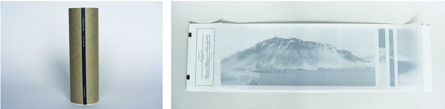
    A reader’s initial impression of Lucy Helton’s Transmission (above),for example, is foregrounded in the book’s superannuated technology of thermal printing, associated with the fax machines prevalent in the late twentieth century. Along with technology, access plays a critical role, as a reader must first free the book from the cardboard tube that holds it. Once released, the rolled thermal prints require a reader’s constant manipulation while paging or the sheets will curl back up. At the same time, handling the book is inexplicably sensual, as the flimsy thermal prints, secured at one end with metal clips, are barely restrained beneath a luscious synthetic paper wrap. The resulting reading experience requires a level of concentration distinct from the tranquil perusal of Lizzie Brewer’s scroll, Ten Meters of Mycelium, discussed in my previous post. Transmission is resistant; its message will only slowly accrue. 

    Transmission’s wonder arises from its mix of nostalgia with the mystery prompted by the book’s title: what message is being conveyed? The thermal prints display grayscale panoramas in images of distant mountains rising out of scrub, and moonscapes reminiscent of long-ago glacial incursions. Only at the end does the colophon relate the backstory, that the artist’s father, an environmentalist, authored a science fiction novel in which nearly all humans lived on other planets so that Earth could survive as a wildlife reserve. The reader holds Helton’s response, not a utopia, but a dystopian warning of an earth devoid of life, the warning reverberating in the mind like a bell tolling unnervingly close, marking the world’s rush toward a future’s worst outcome. 


    A second book, Solastalgia (above), by Sarah Nicholls, also shifts a reader between worlds. The term, solastalgia, refers to the experience of the simultaneous emotions of nostalgia and a sense of loss, common in the world today. Unlike Transmission, Solastalgia revels in color, printed through risograph and letterpress, with pressure prints, woodcut, linocut, and polymer plates on a variety of papers and glassine. Solastalgia begins by enveloping the reader in visions of the lost civilization of Atlantis, its imagery conveying a utopian retreat, in fantastical scenes and fragments of historic maps, vibrant in a tropical palette. Other imagery suggests a shift, in topographic contour patterns that overlay a rippling water motif—land and water converging. Nicholls’s text reflects on the role islands play in the collective imagination, as sites of projected desire and retreats from reality; for example, “We can’t see it, so we don’t really believe it exists / nothing ever truly disappears”. 

    The story shifts, the idyll dissolves, and readers leave paradise to confront the environmental realities facing the South Pacific. Solastalgia tells of Nauru, a tiny island in Micronesia, whose interior is decimated due to strip-mining for phosphate, a natural fertilizer. Readers also learn of the Marshall Islands, which endured atomic bomb tests in the twentieth century, and now faces rising sea levels, forcing its residents to permanently relocate to the U.S. as climate refugees. 


    Two books, two distinct voices, Transmission and Solastalgia each conjure a spell by instigating an experience of wonder, and, once held in thrall, open a reader to warning or revelation. Voice upon voice, the works in Reclamation ask each of us to find our own voice in this global community of stewardship.


    Betty Bright is an independent writer, curator and historian who helped to start Minnesota Center for Book Arts (MCBA). In 2005 she published No Longer Innocent: Book Art in America 1960-1980, and continues to write and curate, including contributing to the forthcoming Materialia Lumina (Stanford University and The CODEX Foundation, 2021).


  • 01 Jul 2021 12:00 AM | Susan Viguers (Administrator)

    Wonder is underrated today, even dismissed, relegated to sensational headlines in glossy magazines or social media drama—in other words, treated as irrelevant or hyperbole. But wonder, defined as “a feeling of surprise mingled with admiration, caused by something beautiful, unexpected, unfamiliar, or inexplicable,” can be a powerful strategy for an artist, and particularly for an artist wishing to entice and involve a viewer.

    In their 2001 book Wonders and the Order of Nature, 1150-1750, Lorraine Daston and Katharine Park trace the shifting status of the state of wonder through history. In the preface, the authors stake out their different perceptions of wonder: “One of us believes that wonders appeal because they contradict and destabilize; the other, because they round out the order of the world.”[1] It is in the meeting of those two responses—to disrupt and then reclaim—that wonder exerts its power, which can be especially useful to artists who make work about difficult truths.

    Wonder is on show in the exhibition Reclamation: Artists’ Books on the Environment, which arose in response to a global call to action. Peter Koch and others called for artists to “raise a ruckus” in 2021, to educate and demand change around environmental threat and loss. Jeff Thomas, Executive Director of San Francisco Center for the Book, agreed to host the show and publish an illustrated catalogue with essays. Thanks to another prompt from Koch, San Francisco Public Library signed on as a second showing site. [2] I was invited to write two blog posts, as co-curator of Reclamation with Jeff Thomas, and as one of the show’s three jurors and catalog essayists (joined by Mark Dimunation of the Library of Congress, and Ruth Rogers of Wellesley College). As jurors, in addition to prioritizing works of excellence and compelling content, we sought works that would reach across the chasm of anxiety and disbelief that many subconsciously employ to distance themselves from unsettling and threatening content.


    Wonder bridges that gap. For example, Judith Tentor’s accordion book, A Photograph of Feather Boa Kelp (above), draws attention from its deep blue cyanotype contact print. A cyanotype is activated when an object is laid atop photosensitive paper, allowing the action of light to create a negative silhouette when the object is removed. Feather Boa Kelp’s initial impact is in its scale of nearly fifteen feet, an accomplishment in the cyanotype medium. Equally striking is the work’s lacy patterning that ripples along the folded sheet as if the kelp (a subgroup of seaweed) is still afloat. Once a viewer advances into reading proximity, the text reveals that its openwork pattern is evidence of the feeding of a seaweed limpet, which has followed the kelp in its expanding range due to the warming ocean. Tentor’s specimen was found in the waters off San Diego, and the kelp’s range now reaches from Alaska to Mexico. As an artist’s book, Feather Boa Kelp carries evidence of climate change directly into a reader’s hands.


    A second work, Ten Meters of Mycelium by Lizzie Brewer (above), also draws a viewer’s gaze through the beauty of its ink and graphite drawings of mycelium, the vegetative part of a fungus, depicted here in fine white filaments that gather and release across the sheet. The title also notes the scroll’s extraordinary length of ten meters (thirty-three feet), the majority of which remains hidden, furled within the scroll structure, viewable only in increments. Wondrous indeed, a viewer can imagine slowly exploring the sheer breadth of it, as the exquisite renderings come into view only to be tucked away again as the scroll is forwarded. Like a microscopic sample brought into focus, Brewer’s drawings of magnified mycelia represent billions of fungi, mycelia, and roots. This life-giving network produces and nurtures the soil’s biosphere across the earth’s surface—literally sustaining the ground under our feet.

    Through wonder, A Photograph of Feather Boa Kelp and Ten Meters of Mycelium transform our familiar but unnoticed forays into a heightened mindfulness of the urgency of climate change, while exploring a shoreline or simply walking on terra firma.

    [1] Lorraine Daston and Katharine Park, Wonder and the Order of Nature, 1150-1750 (New York: Zone Books, 1998) 11.

    [2] Reclamation: Artists’ Books on the Environment is on show at San Francisco Center for the Book from June 9 – September 26, and at San Francisco Public Library from June 19 – September 5. I also wish to thank Jennie Hinchcliff of San Francisco Center for the Book, and Joan Jasper of San Francisco Public Library, for their dedication throughout this project.


    Betty Bright is an independent writer, curator and historian who helped to start Minnesota Center for Book Arts (MCBA). In 2005 she published No Longer Innocent: Book Art in America 1960-1980, and continues to write and curate, including contributing to the forthcoming Materialia Lumina (Stanford University and The CODEX Foundation, 2021).


  • 15 Jun 2021 12:00 AM | Susan Viguers (Administrator)

    Ancient examples of accordion-folded books have been found in many parts of Asia, including China, Japan, Korea, Thailand, India, and Burma. In China the accordion (musical instrument) is called a shou feng qin, which literally means “hand-wind-instrument.” The name for the book structure is jingzhe zhuang: jingzhe means “neat-folded paper” and zhuang means “binding.” The earliest examples of jingzhe zhuang bindings are from the Tang Dynasty (618-907 CE). There were two earlier systems in China for “binding” texts. Some texts were written on silk cloth, usually rolled up as scrolls. The Chinese word for this structure is shoujuan, which literally means “hand roll-up.” Texts were also written on wood, usually bamboo cut into thin vertical strips, laced or knotted together horizontally with cord, then either rolled like a scroll or folded back and forth in a stack. The folded variation of this binding style is known as jian du, and examples date back to the fifth century BCE. It was not until after the invention of paper, in the second century CE, that Chinese bookmakers adapted the jian du structure to make jingzhezhuang bindings. A miniature jingzhe zhuang (10 x 14 cm) was found at the Dunhuang archaeological site in Western China, and thus, made before 900 CE, it is the oldest-known miniature accordion book.

    In Japan, the accordion-folded book structure is called an orihon. The word combines the root words ori (fold) and hon(book). According to legend, it was during the Heian period (794–1185 CE) that a Buddhist monk squashed his sutra scroll and then folded it up, thus inventing the orihon binding. Japanese orihon books were made using paper: either a single long strip folded back and forth, or several smaller strips connected together before folding. Another variation of the orihon binding was called a sempuyo. In this binding, individual folded sheets are arranged with the folds all facing the same direction, and then each fore edge is adhered to the adjacent fore edge. The cover is adhered to the first and last pages of the text block, but it is not attached to the spine. Because of this, the sempuyo is often called a flutter book: if it is dropped or blown by the wind, the pages will flutter but remain attached to the covers. It is said that monks used such books medicinally, believing that the breeze created by moving the pages of the holy sutras could heal an injury.

    In pre-Columbian Mexico and Central America, the Aztec and Maya made books with folded structures. These books are commonly called códices. Mayan códices were written in hieroglyphic characters, called glyphs, on amate, a paper-like material made from the bark of a certain type of fig tree. There was a Mayan glyph for the word códicejuun, but it looks more like a hamburger than a book. Written pages were pasted together and then folded back and forth to create an accordion-folded book. The Spanish invaders destroyed most of the original códices, and though some original text blocks survived, there are no original bindings. Some scholars believe the text block was glued to wooden covers, others that the text block and covers were wrapped together with leather cords. 

    It is unknown when the first accordion book was made in Western Europe. The oldest extant example I could find was handwritten, in Cyrillic script, in 1330. This manuscript, known as Canones et carmina sacra quae…, is now in the Netherlands’ Leiden University Library. 


    While there were other examples of accordion-folded manuscripts, the binding structure was not used in the early printed books. Although there were over 30,000 distinct editions printed during the incunabula period (1450–1500 CE), no known incunabulum has an accordion structure.

    Other than the Canones et carmina, the earliest accordion books made in Western Europe that I have discovered were miniature books printed and bound to be sold as souvenirs. As far as I know, none of those books include a printed date of publication, but some have the publisher’s name (for example, the Recollections of . . . series printed in London by J. Newman & Co.) and others have a traceable provenance, so we know they were made in the early to mid-1800s.

    We may never know who made the first accordion book, or when it was made, but at least we do know when and who made the first real accordion book.  Accordioning to respected book arts historians:  in 2002 Peter and Donna Thomas cut the bellows of an accordion, allowing them fold back and forth, inserted paper panels printed with text and image into the folds, and made their first Real Accordion Book out of Peter’s old 12 bass piano accordion. That first real accordion book was followed by a series of others.

    Peter and Donna Thomas. A New History of the Accordion Book. 2016.

    The works are tied together by structure, text, and image. A collection of photographs rotates through the series – old favorites reappearing, new images being presented for the first time. The texts have, for the most part, been explorations into the history of the accordion and of the accordion book. We have tried to add new information to each subsequent book, and since a history of the accordion book has not been previously published, finding information has been hard. We hope that by sharing what we have learned in these blog posts, others will come forward with what they have discovered, and together, as a community, we can write a more complete history of the accordion book. 

    Peter and Donna Thomas are book artists who make editioned and one-of-a-kind books. They make the paper, print, illustrate, and bind their books, combining the precision of the fine press aesthetic with the creativity found in contemporary artists' books. Between 2009-2019 they traveled the USA as the Wandering Book Artists.

  • 01 Jun 2021 12:30 AM | Susan Viguers (Administrator)

    In 2000 I had the idea to make an accordion book. Not your regular accordion book, this one would be made from a real accordion, with the keyboards as covers, and the bellows would be cut along the vertical ends, so that when it was pulled open it would look like a real accordion book! I play the accordion and couldn’t pass up the opportunity presented by the visual pun, but the real purpose for making the book was to address a point of confusion among book artists: whether a folded paper book should be called an accordion book or a concertina book. From playing both musical instruments, I knew that an accordion is rectangular, and a concertina is hexagonal. I made my first real accordion book in tandem with a book made out of a concertina to physically explain why, unless a book is hexagonal in shape, the correct term is accordion book.


                                  Peter and Donna Thomas, The Real Accordion Book, 2001

                                 Peter and Donna Thomas, The Real Concertina Book, 2001                                                                                  

    Following is my short history of the accordion book, explaining how format came to be generally know called an accordion book.

    The word accordion was first used early in the nineteenth century to describe a small, portable, box-shaped musical instrument. It had a button keyboard on the right-hand side for playing melody notes, another button keyboard on the left-hand side for playing bass and chordal accompaniment, and folded paper bellows connecting the two keyboards together. Metal reeds, attached to the keyboards, were mounted inside the bellows. When buttons were pushed while the bellows were being expanded and contracted, air was forced past the metal reeds, causing them to vibrate and produce sound. The term accordion book borrows from the musical instrument. It describes any book having a folded, rather than sewn, text block, where the pages are pleated – folded back and forth in a manner similar to the bellows of an accordion, rather than being folded as a map – and are viewed by expanding the book like an accordion.

    The invention of the accordion was inspired by an ancient Chinese, mouth-blown musical instrument called the sheng. The sheng was first displayed in Western Europe in the late seventeenth century. It used free reeds in resonator pipes to create musical sounds, and this concept led to the invention of several different harmonica-like instruments. The success of those inventions encouraged organ-makers to try a new direction in their efforts to create low-cost pump organs for small-town churches; this, in turn, led to the creation of the accordion. Most historians credit Cyrill Demian, of Vienna, as the inventor of the first accordion. In 1829, he patented an instrument where the left hand operated a button keyboard and the right hand moved the bellows. He called his invention an Akkordion. The word is based on akkord, in this case referring to musical harmony, with the suffix –ion, being thought to derive from the word clarion, a sort of medieval trumpet.

    In some countries the accordion’s name is a variation on the word harmonica (for example, harmonika in Bosnia and harmonikka in Finland). In Italy it is called a fisarmonica, said to be derived from physharmonica, the name given by Anton Haeckl to his 1818 invention that combined harmonica and bellows to make an instrument resembling the modern hand-held harmonium. Other countries have unique names; for example, in Sweden it is called a dragspel, where drag means pull and spel means play. The accordion also has nicknames: in English it is sometimes called a squeezebox, and in Germany it is sometimes called a schifferklavier (sailor's piano). Sometimes the accordion is mistakenly called a concertina, or vice versa, but the words are not interchangeable. Though the concertina is also in the aerophone family, it is typically smaller, shaped as a hexagon rather than as a square or a rectangle, and its buttons are organized differently.

    Accordion books, like musical accordions, can also have different names. For example, German binders call accordion books Leporellos. In German dictionaries, Leporello is defined as “a fan of folded paper.” In the 1787 opera Don Giovanni, with music by Wolfgang Mozart and an Italian libretto by Lorenzo Da Ponte, Don Giovanni’s servant is named Leporello. In Act 1, Scene 2, Leporello sings what is now commonly known as the “catalogue aria.” In this scene, Leporello takes a book from his bag and pulls out a long folding strip of paper that lists all of Don Giovanni’s romantic conquests. (I find it interesting to speculate which came first; was the servant named after the book structure or vice versa?) The term concertina book, for me a misnomer, is used by some English speakers to describe an accordion book. Perhaps this originated in England, where the concertina was more popular than the accordion.

    While the history of the accordion began in the seventeenth century, the history of the accordion book is actually much older, and that will be the subject of the next post.


    Peter and Donna Thomas are book artists who make editioned and one-of-a-kind books. They make the paper, print, illustrate, and bind their books, combining the precision of the fine press aesthetic with the creativity found in contemporary artists' books. In 2021 The Legacy Press published Peter and Donna Thomas: Bibliography, 1974–2020.


Powered by Wild Apricot Membership Software